What is the current branding?
This eCommerce product empowers users to sell their products across multiple marketplaces while managing all their products and listings from a single interface. It features a rich and complex array of data related to sales, products, listings, orders, and more.
How is the brand currently perceived?
Having conducted over 100 user interviews in the past three years, I’ve gained valuable insights into how our product is perceived across a diverse user base. Here’s a summary of the feedback I’ve gathered:
Pros
Users love the massive amount of data the product provides. They can always trust the product to do its job, relying on it's massive data storage and complex automated algorithms.
Data-Rich
Analytical
Reliable
Feature-Rich
Trusted
Cons
Users also find the product to be cluttered, outdated, and for advanced users only (which was not the intention!)
Outdated
Cluttered
Too Advanced
Dull
Information Overload
Unpacking the ✨NEW✨ branding materials
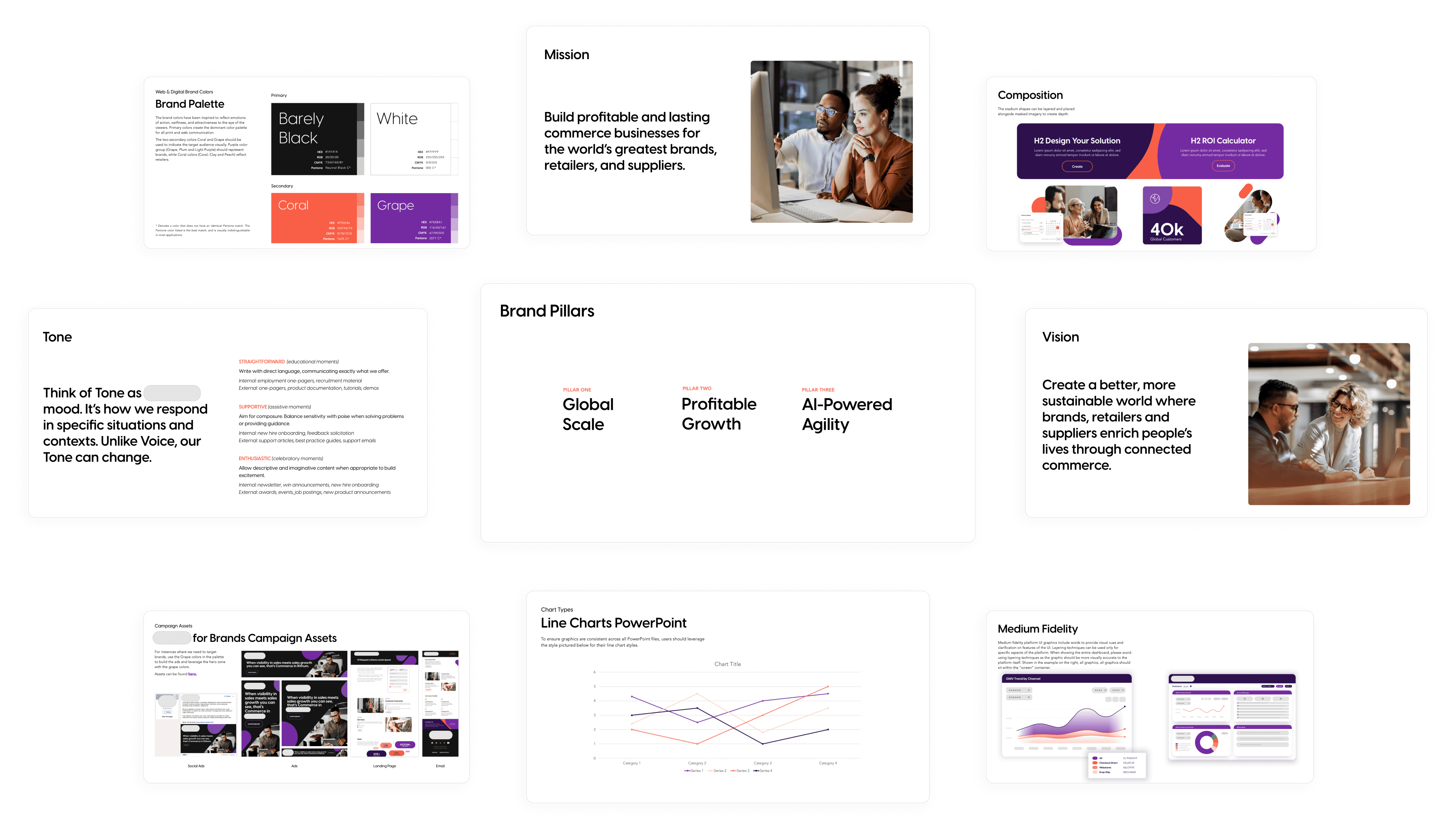
Our marketing team collaborated with a top-tier branding agency to create the company's new identity. The agency provided a comprehensive suite of branding materials, including the vision, mission, tone, core pillars, primary brand colors, typography, chart examples, and more.
Team discovery workshop
Those branding materials were a LOT to take in! Our product design team got together to try and make sense of it all.
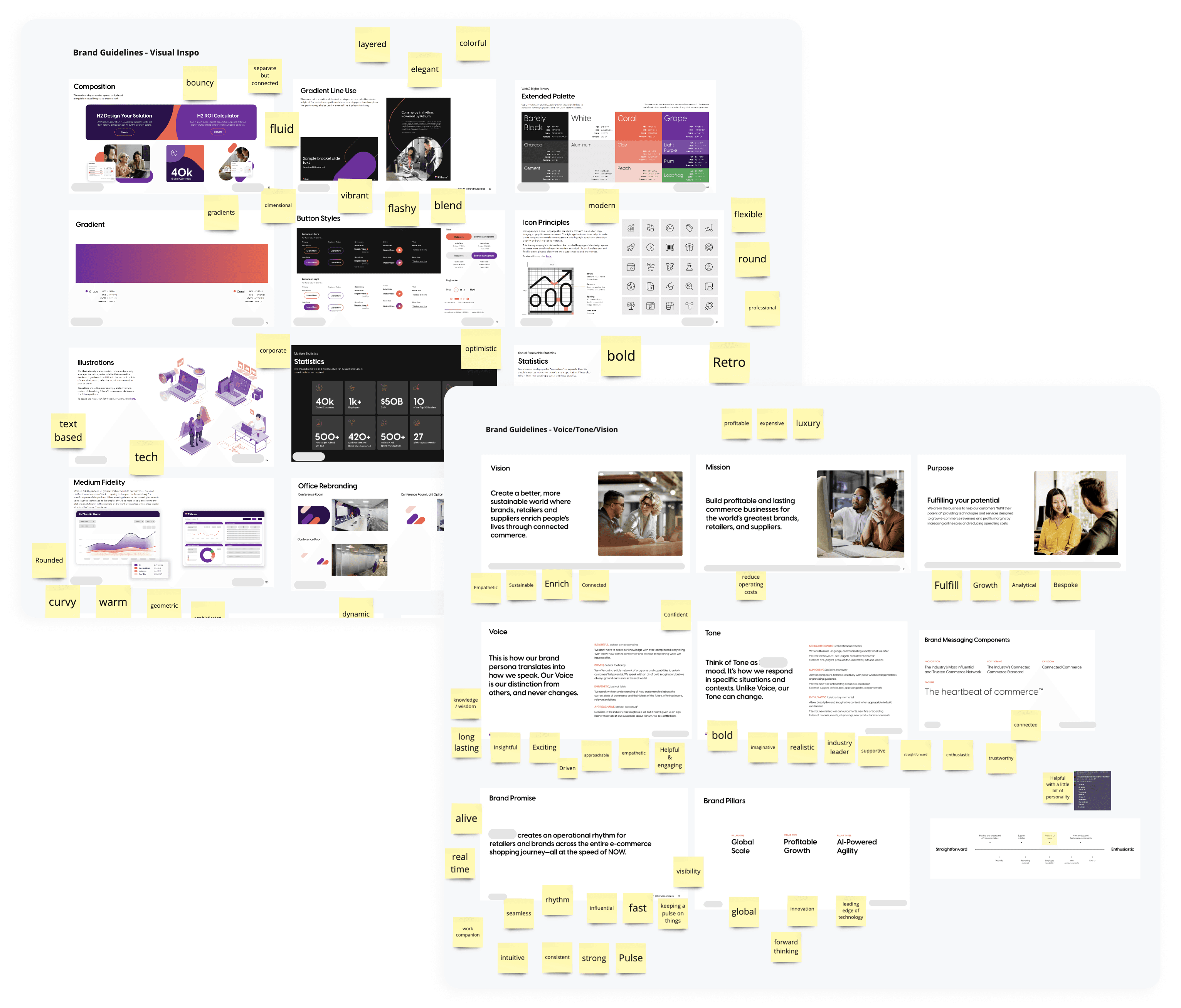
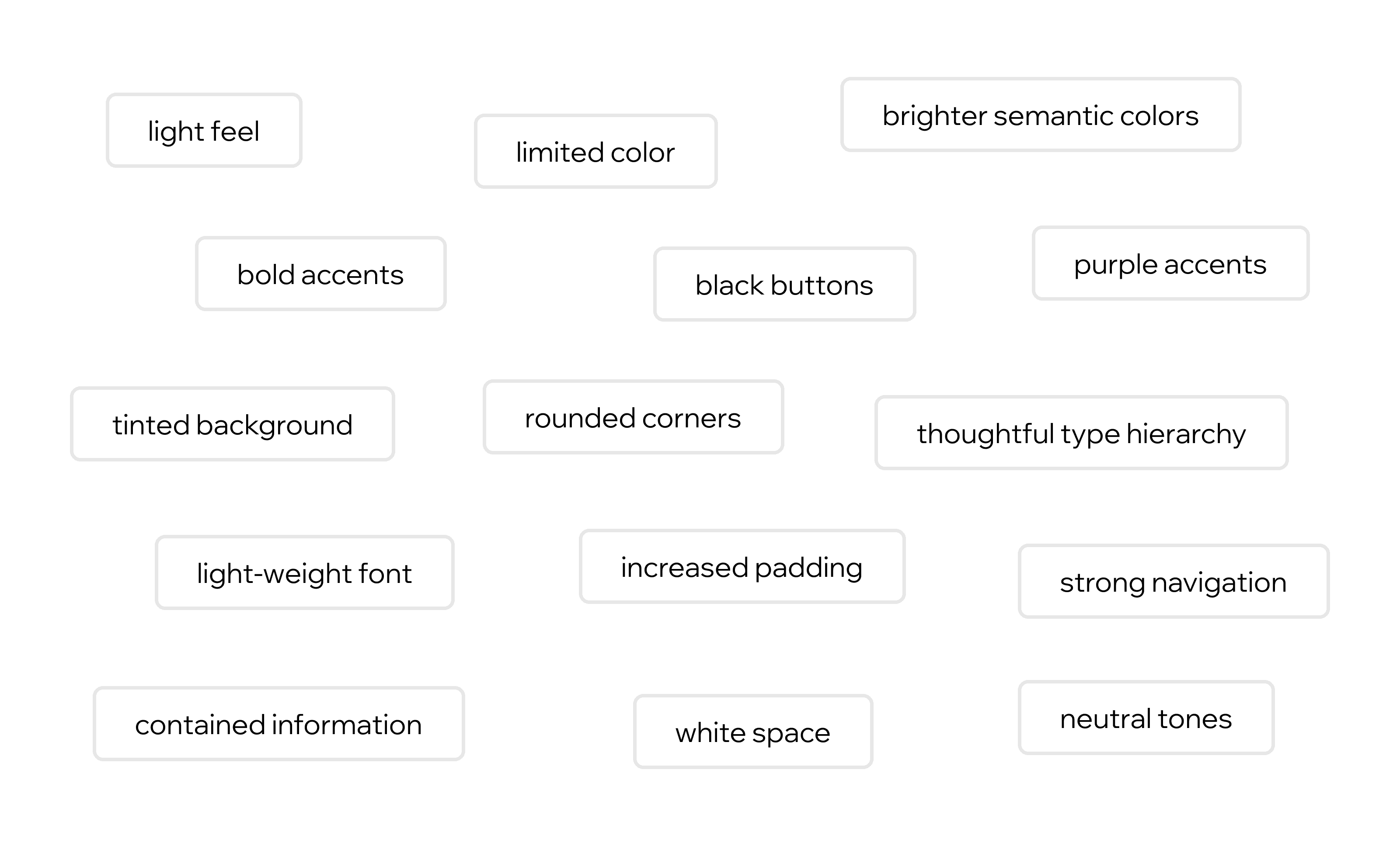
We compiled all the materials into a white boarding tool. Each team member added stickies with words describing what the new brand made them think and feel.
As we collaborated, clear themes and patterns began to emerge!
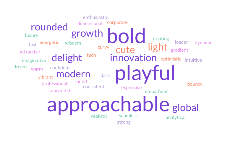
We used a word cloud generator to visualize the most prevalent interpretations of the new brand.
This revealed an intriguing mix of themes - bold and modern, yet also playful and approachable.
Researching the common themes
Three common themes emerged from our review of the brand materials: Bold, Playful, and Approachable. We sought out examples and inspiration for product designs that embodied each of these themes.
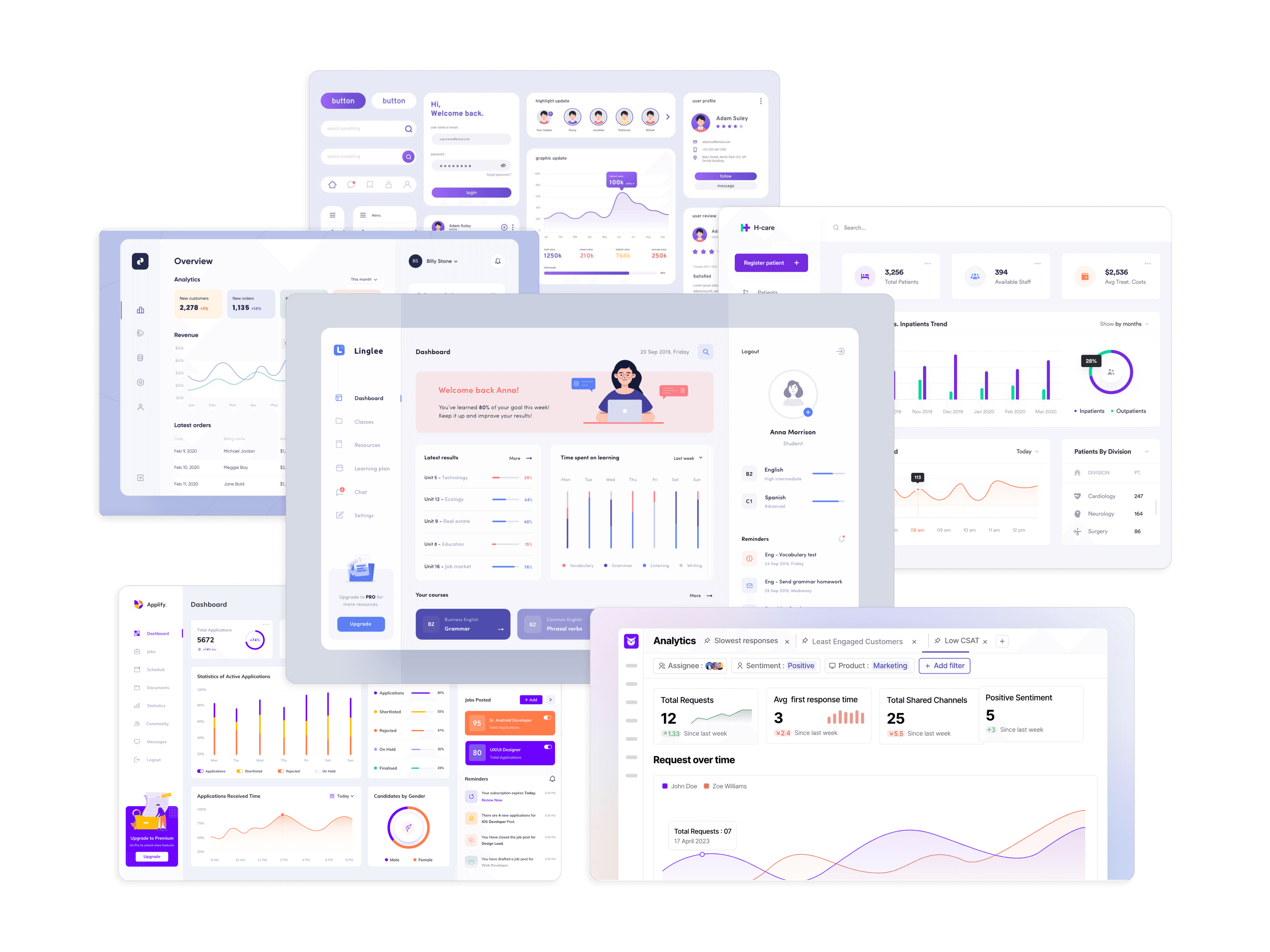
INSPO
Bold
This theme evokes a feeling of confidence and strength, marked by the following elements:
Strong navigation anchors
Confident usage of brand colors
Dark filled containers with light text
Thick title text styles
High-contrast foreground elements
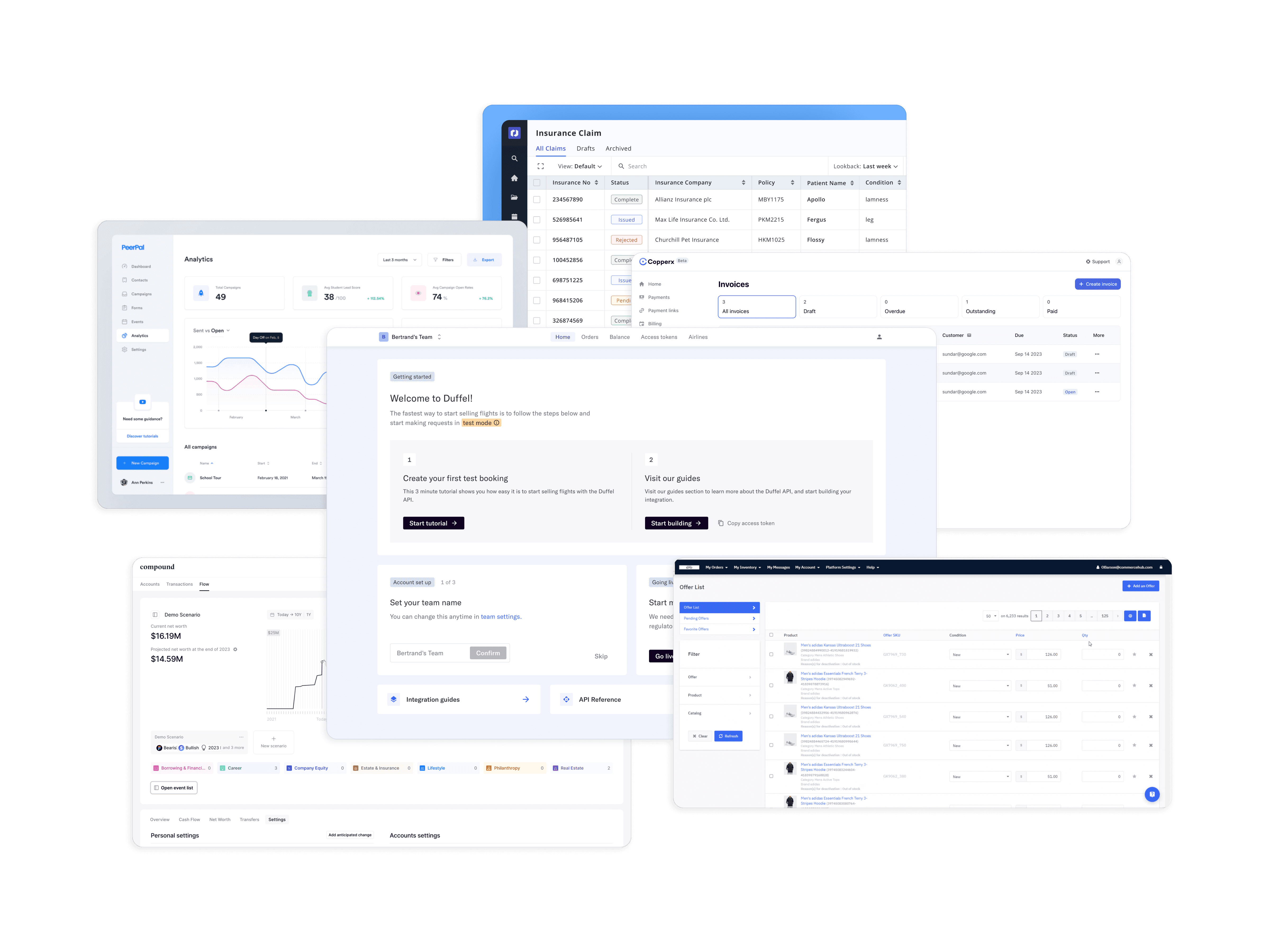
INSPO
Playful
This theme looks cute and friendly, marked by the following elements:
Rounded elements, such as cards and buttons
Use of cheerful, pastel brand colors
Subtle gradients to add character
Use of shadows for separation, instead of borders
Light navigation anchors
Decorative use of icons
INSPO
Approachable
This theme feels straightforward and simple, marked by the following elements:
Ample white space to remove clutter
Clearly defined layouts and groupings
Minimal use of brand colors
Primarily soft and neutral tones
Subtle contrast of foreground elements
Light-weight font styles with minimal variations
Creating style tiles
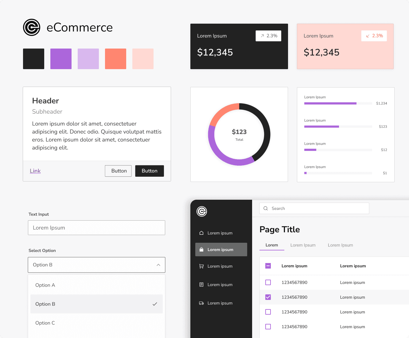
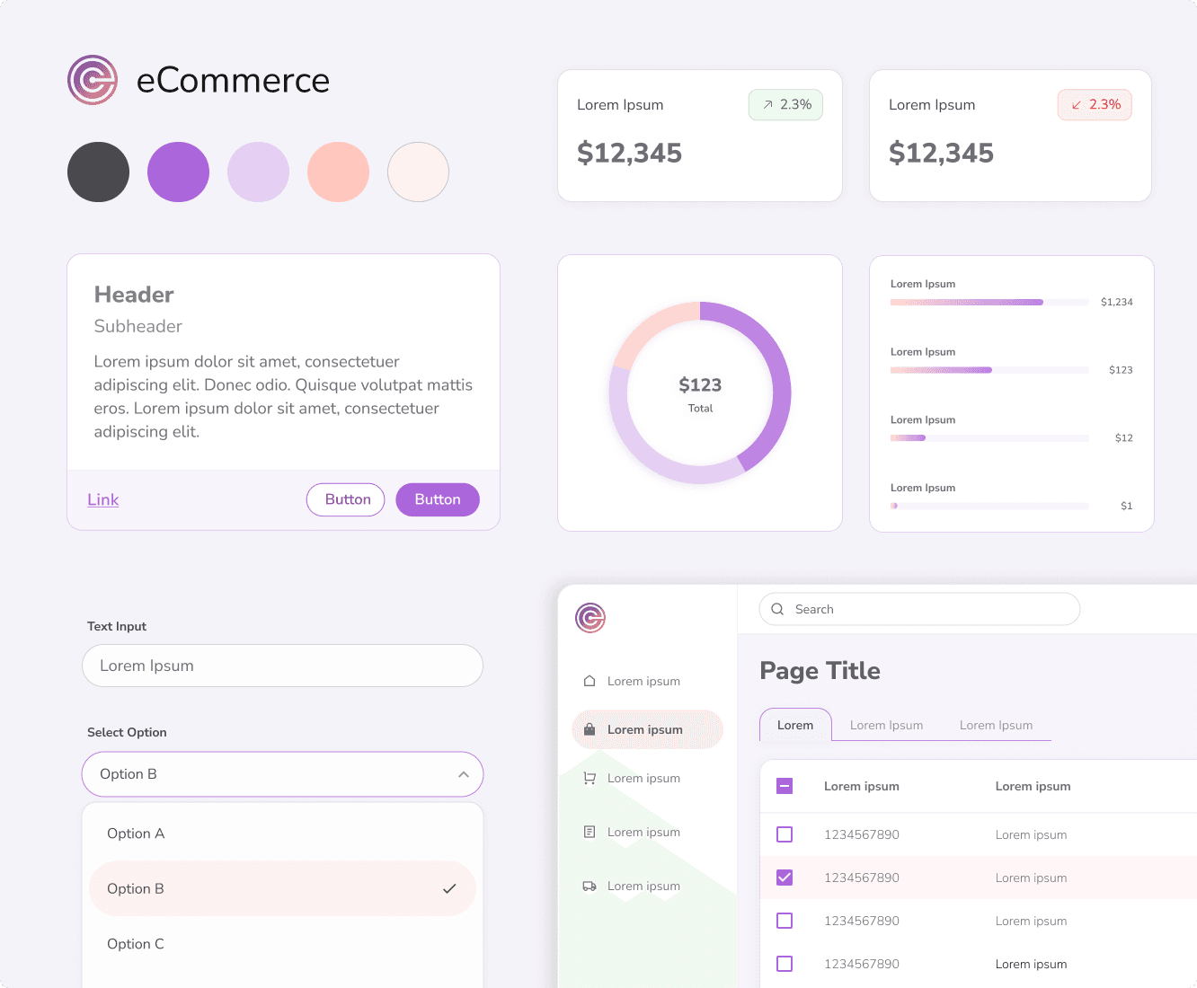
To demonstrate how each style could be applied to our eCommerce product, I created style tiles that incorporate each theme using the new brand colors and typeface. This exercise pushes the boundaries of each style for exploration and visual experimentation.
Bold
To communicate confidence and strength, this style leans into the high-contrast colors of the brand palette. The black primary color acts as an anchor for the navigation, and a highlight for primary actions and callouts.
Playful
This style went over the top with the pastel colors in the brand palette. The hint of gradients and ultra-rounded radiuses add that light, playful character. Punchy colors are reserved for actions.
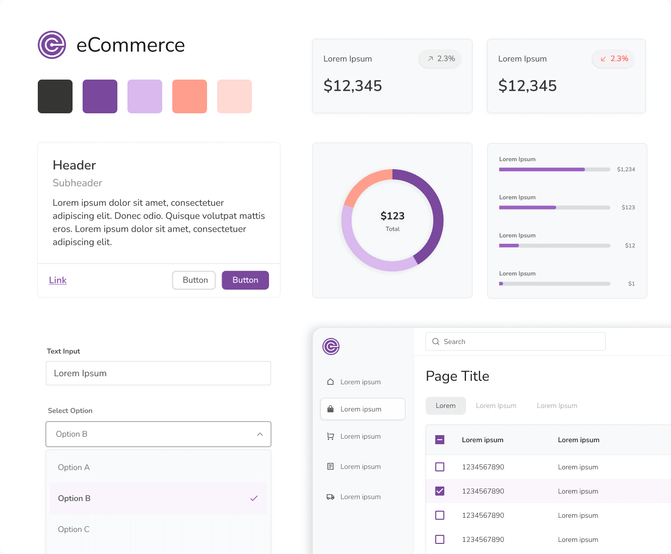
Approachable
To communicate simplicity and ease, this style focused on white space and only used strong brand colors for the most important elements. Styles such as radius and elevation are subtle, not drawing attenton.
What was the feedback?
Key stakeholders reviewed the style tiles and shared their feedback. Below are the elements they favored. Overall, the team preferred the approachable style but suggested incorporating some bold elements to stay aligned with the new brand identity.
Formulating design principles
Using the new branding materials and stakeholder feedback on design concepts, I developed updated design principles to guide our decision-making as we transition into the next design phase.
Unified and Powerful
This unified brand makes our product the most powerful multi-channel eCommerce platform in the world. The experience should evoke feelings of limitless, global opportunity.
Focused Attention
Our platform is full of complex data. While we can’t (and shouldn’t) always achieve a minimalist design, we can focus attention on the task at hand and highlight important information.
Growth Driven
Our product is all about helping users scale their business. Always look for ways to introduce new opportunities, provide recommendations, and help users expand their goals.
Scalable Patterns
Our users have to perform similar tasks across multiple marketplaces. These experiences should feel cohesive and familiar so that users can fly through them.
Inclusive Design
No user should feel like our product is too advanced for them. Anyone, no matter their experience, should be able to use our platform efficiently with ease.
Hint of Delight
Let's embrace the challenge of making a typically 'boring' business and data oriented job more enjoyable, without causing distractions.
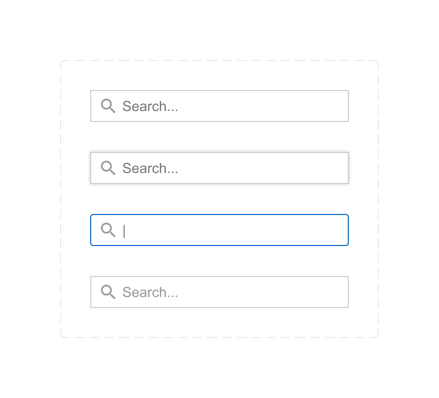
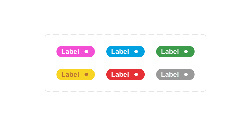
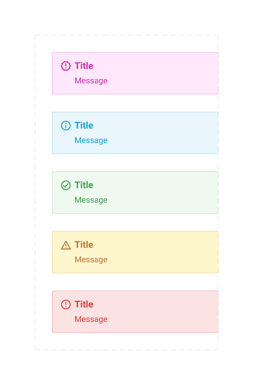
Updating the foundations
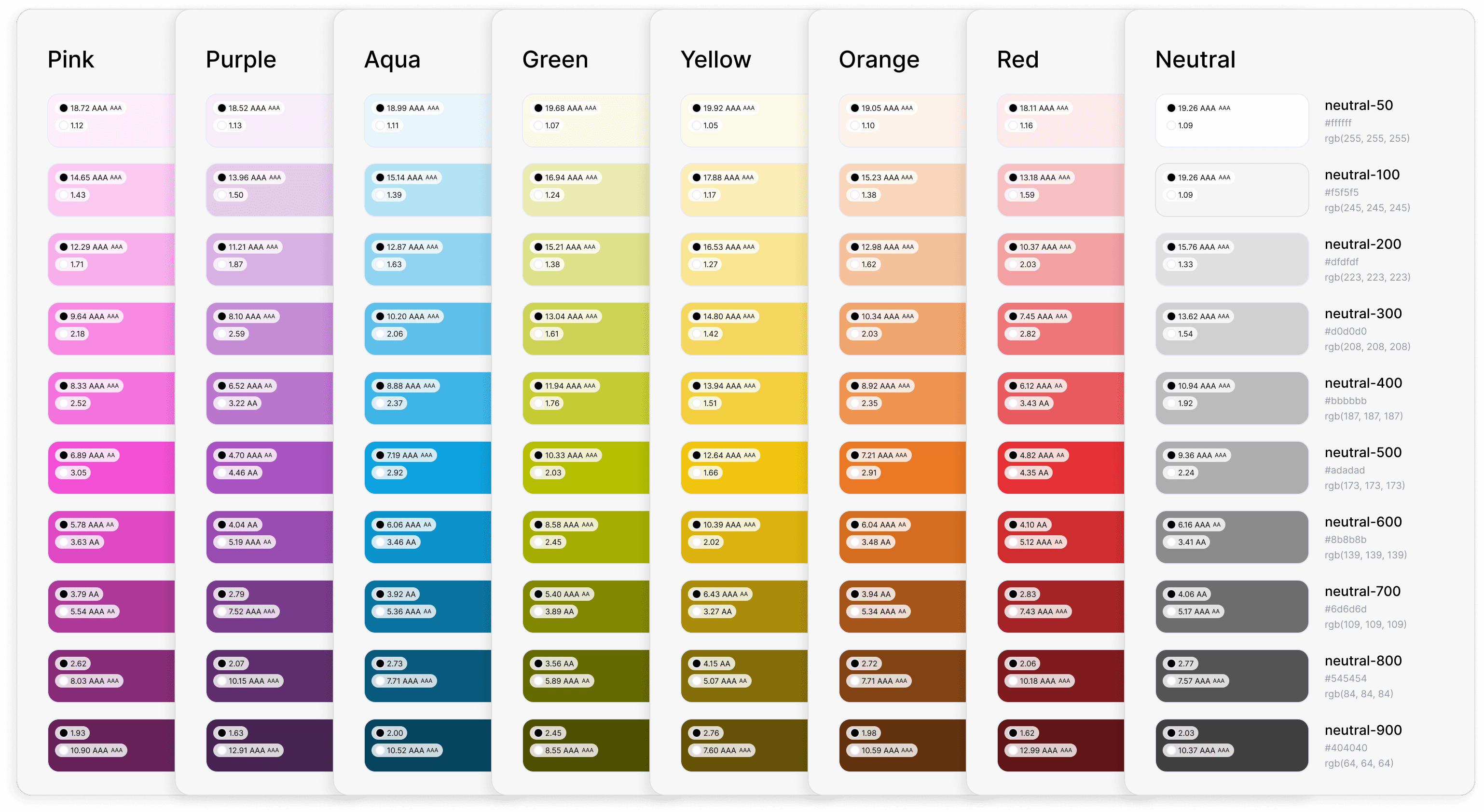
All foundational elements of our design system - color, typography, icons, elevation, radius, and spacing - needed to be adapted. The new brand colors required a completely new complementary semantic palette. While some semantic variables could be updated directly with their new counterparts, others required more thoughtful consideration.
New Brand Colors
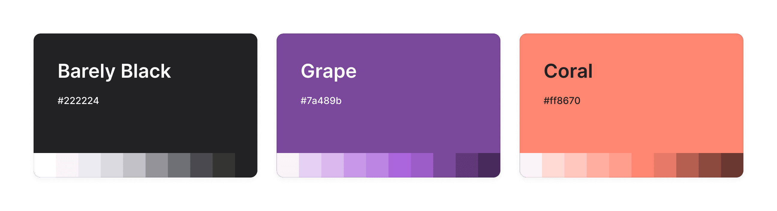
Primitive Colors
Before
After
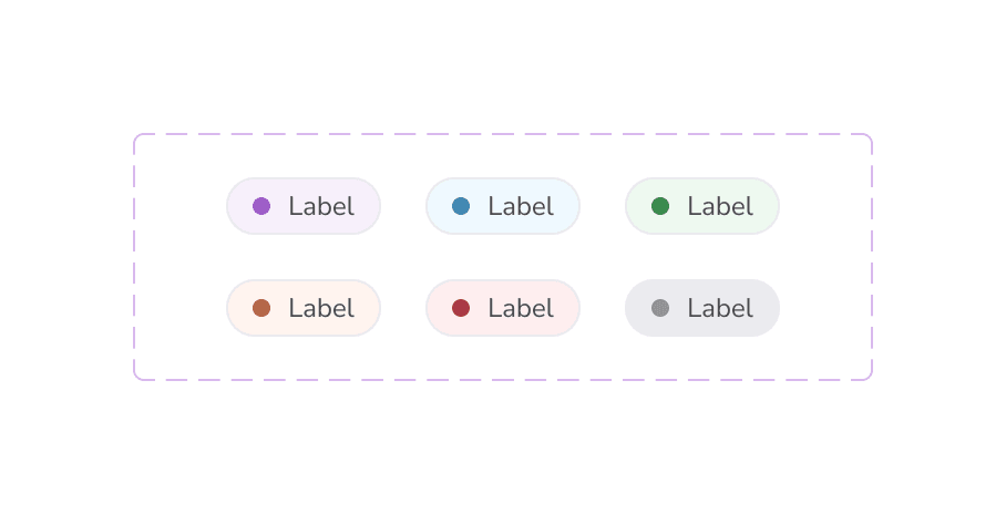
Color Variables
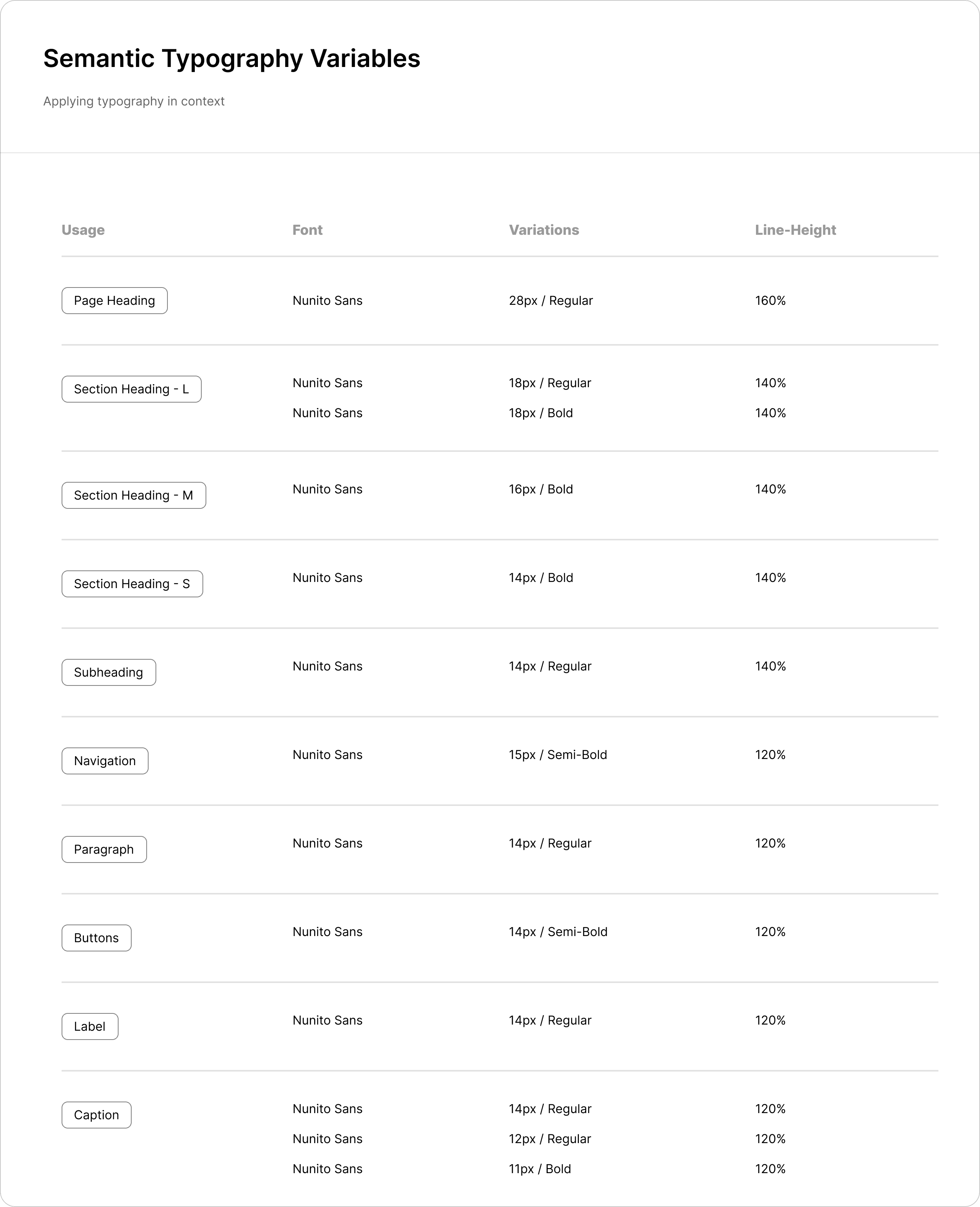
New Type Face
Typography Variables
Before
After
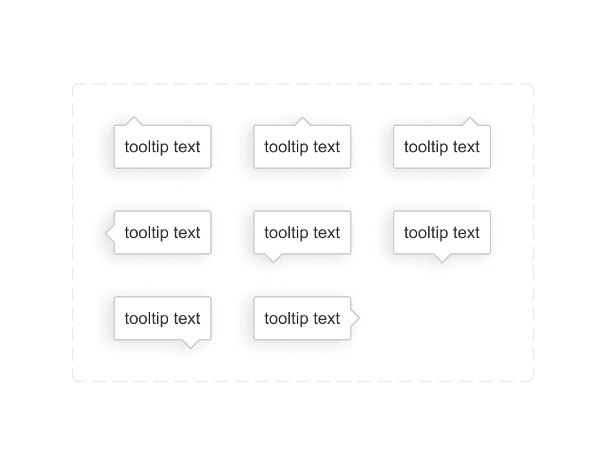
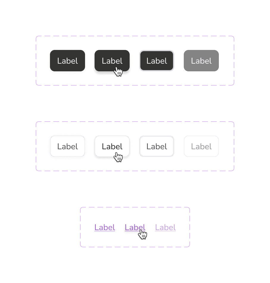
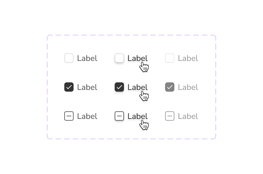
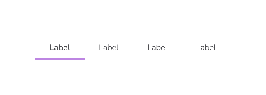
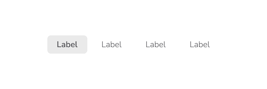
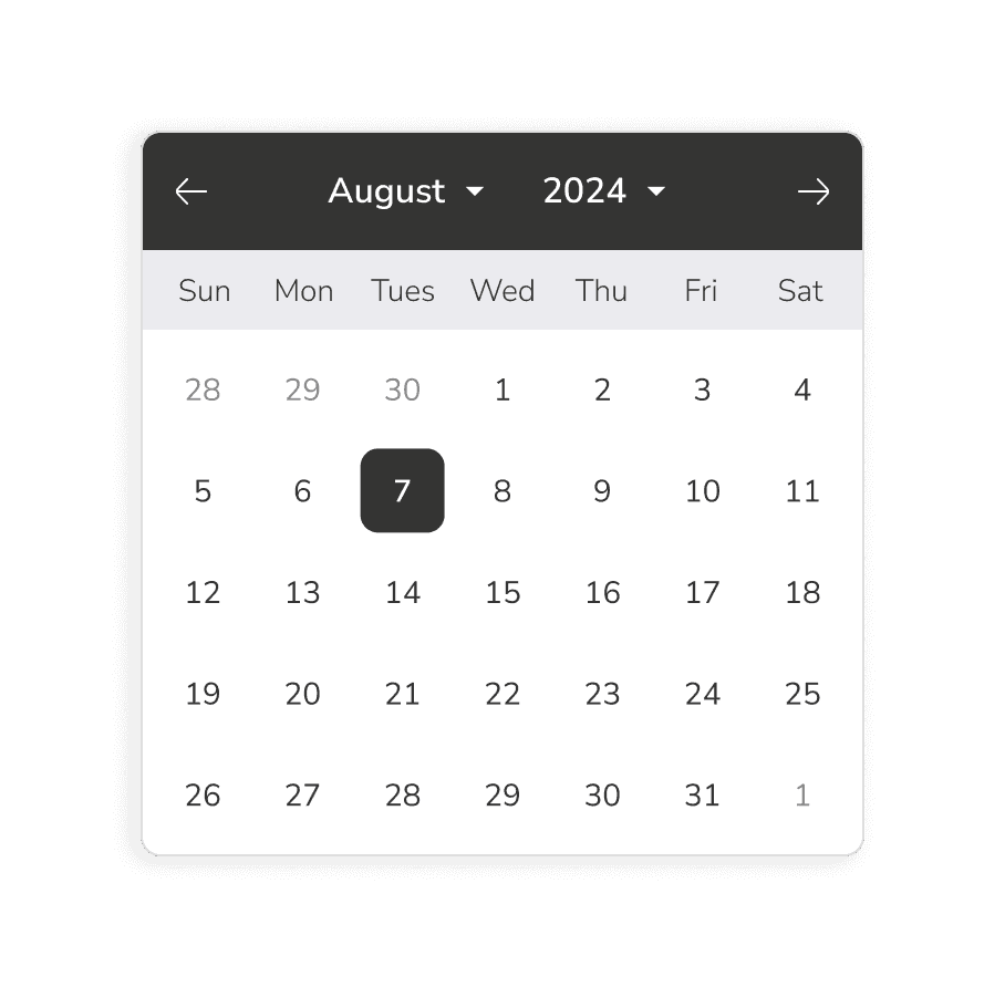
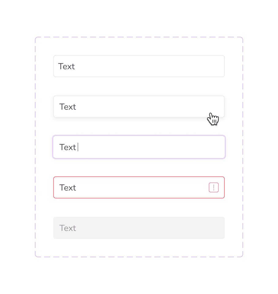
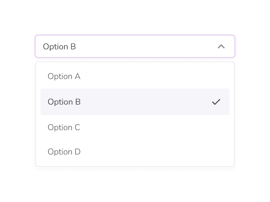
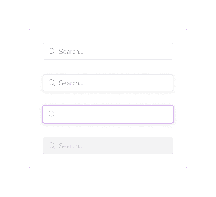
Applying foundations to components
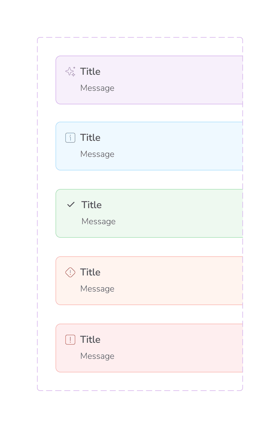
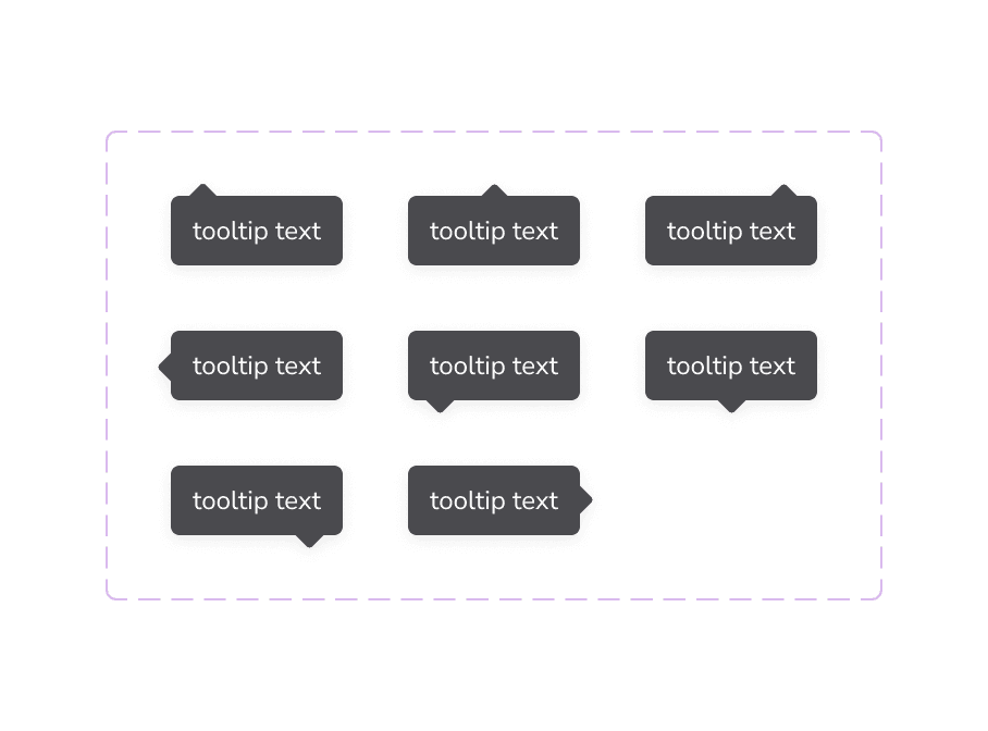
All of those changes to our variables were then pushed to update our core componentry (thanks for variables, Figma!! 😍). Here's a before and after of the component changes that were made.
Before
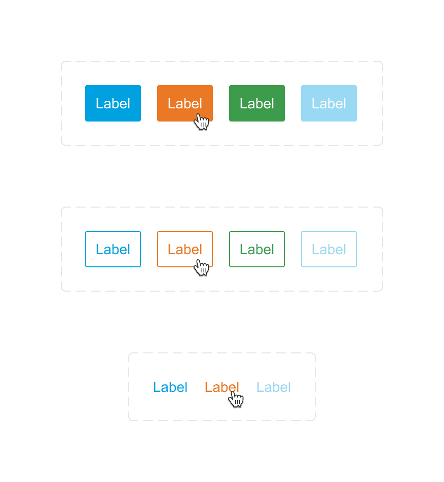
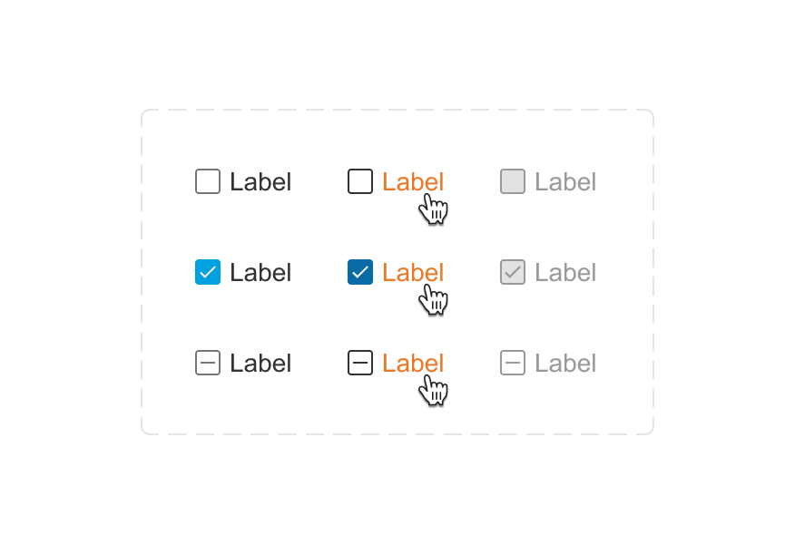
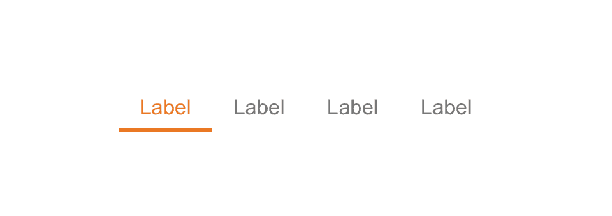
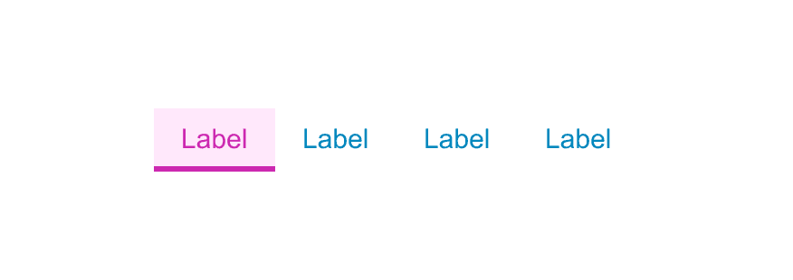
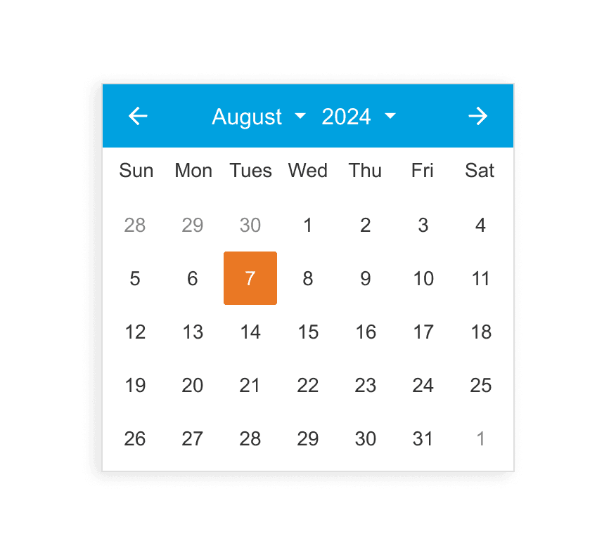
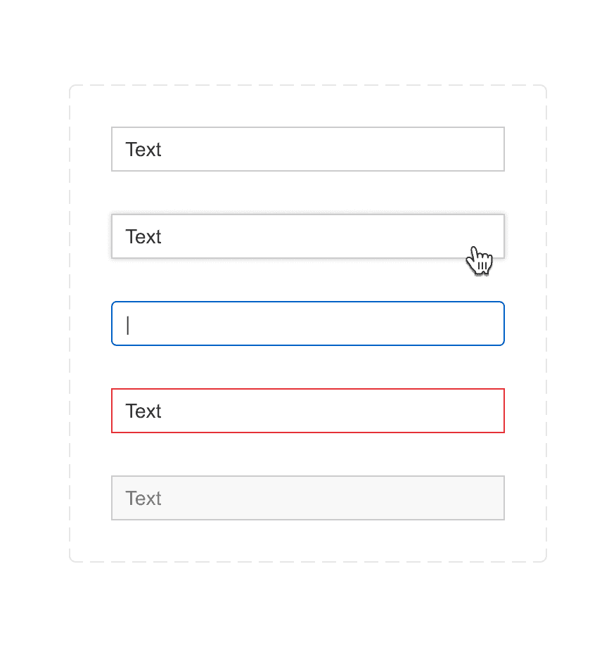
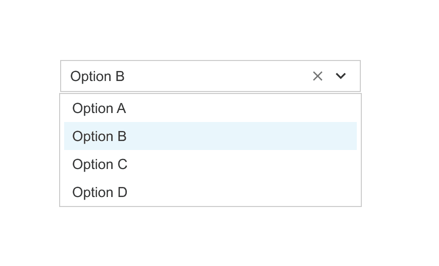
After
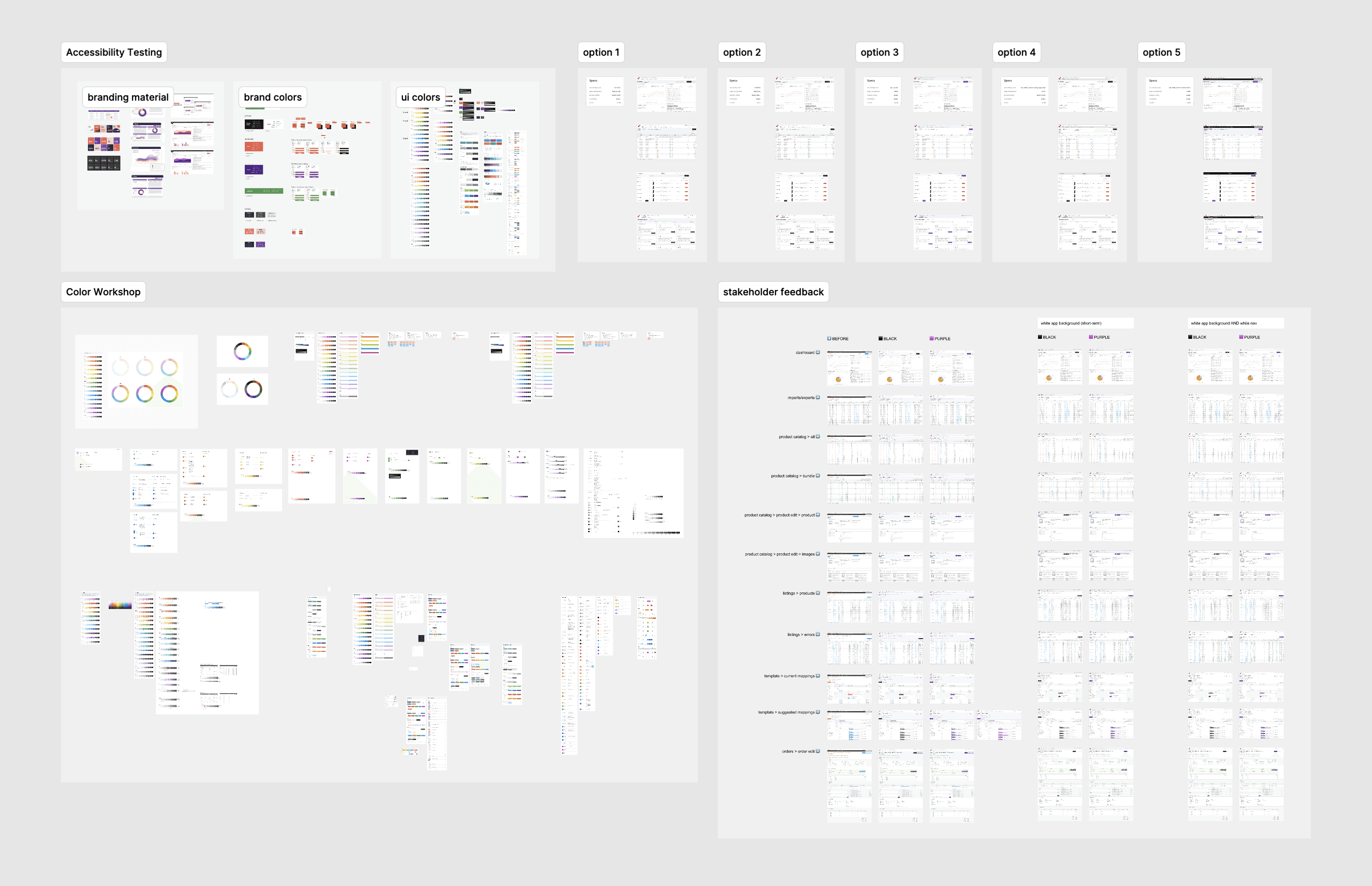
Making tweaks in context
In case you thought we got all of that right on the first try... we didn't! Here's a small peek at allllllllll of the iterations it took to get to a place that myself and all of the stakeholders were happy with.
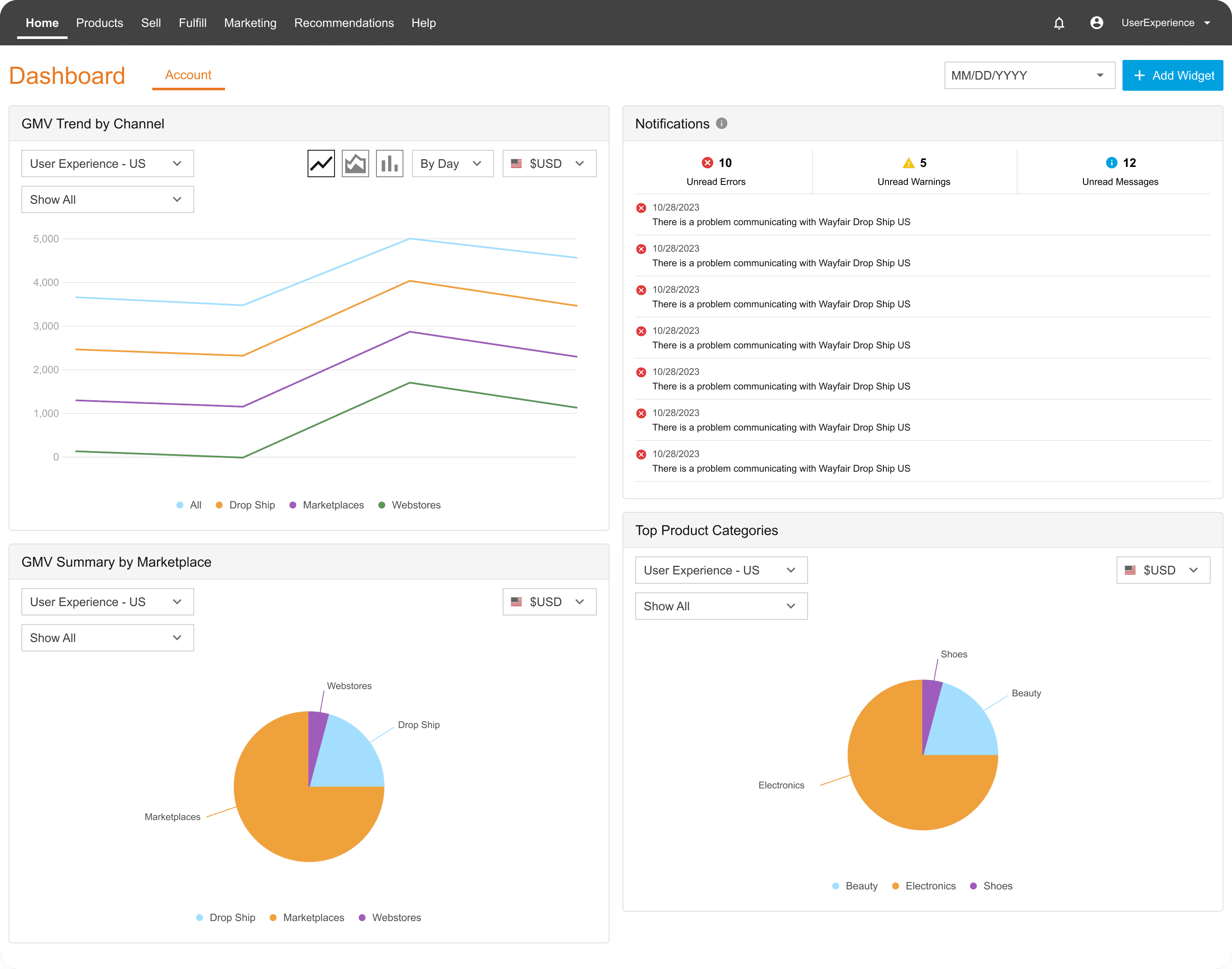
Overview Dashboard
Before
After
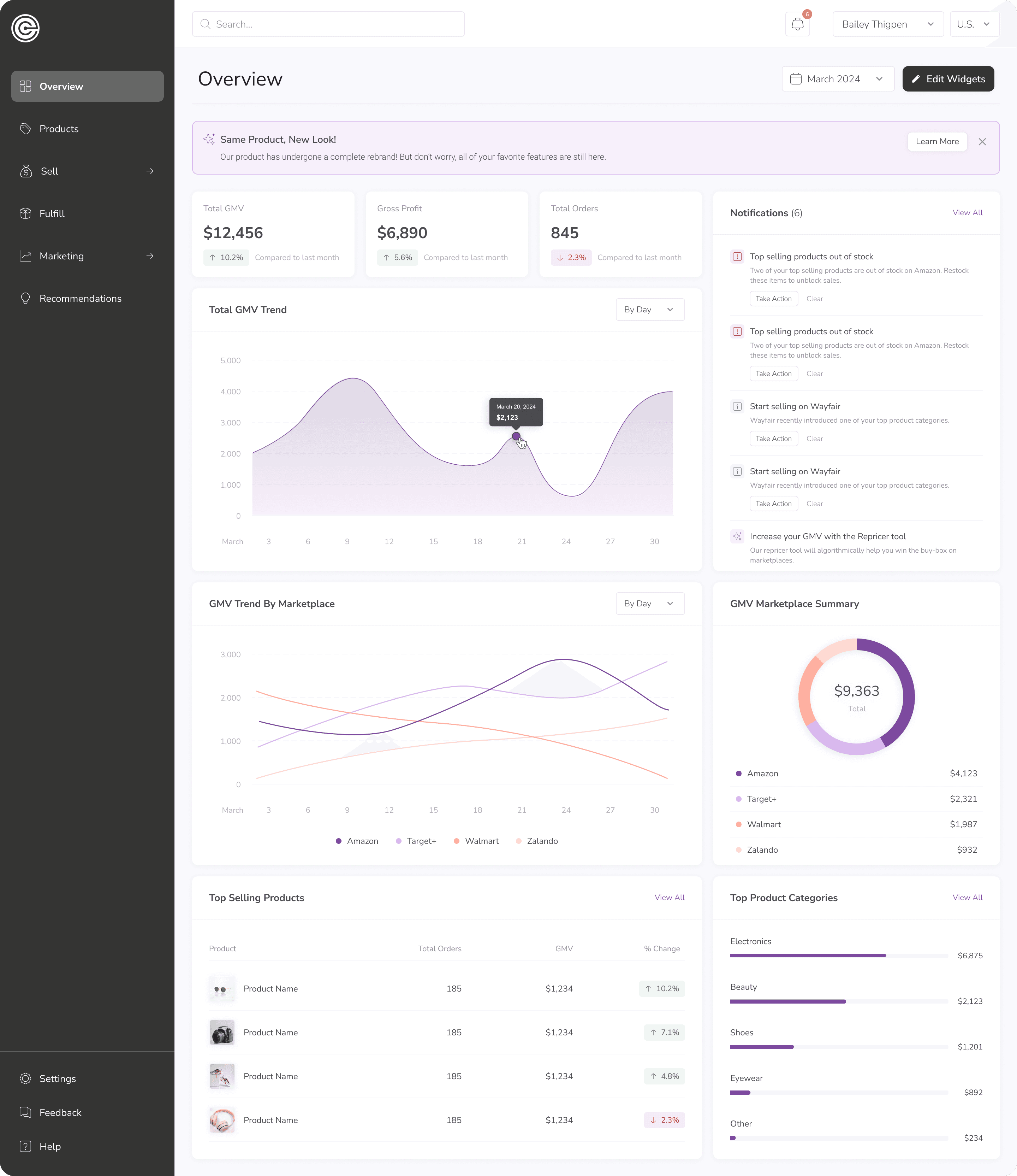
✅ Gave users the top stats they're looking for daily
✅ Added relevant summary charts
✅ Improved focus on top-priority items
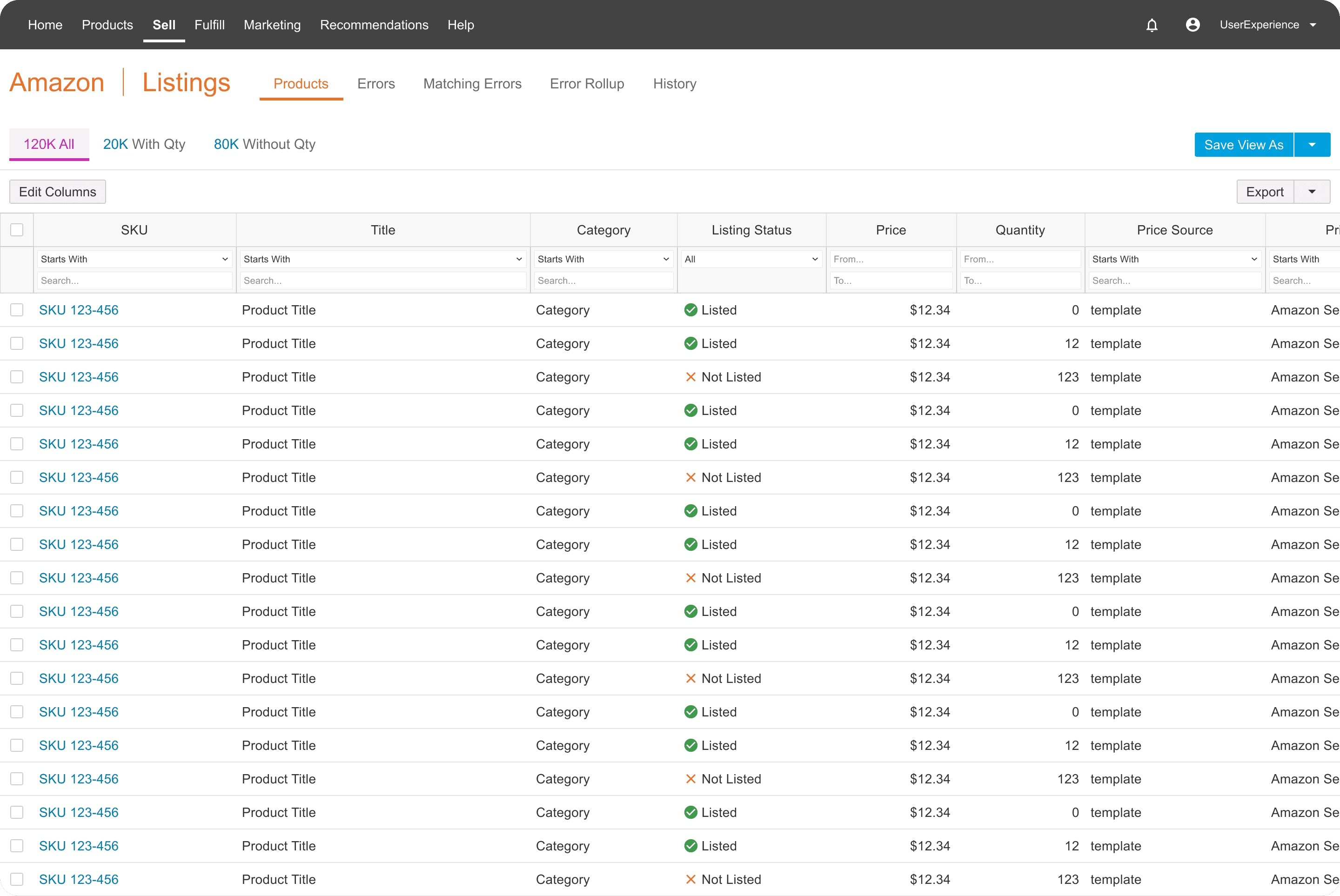
Amazon Listings
Before
After
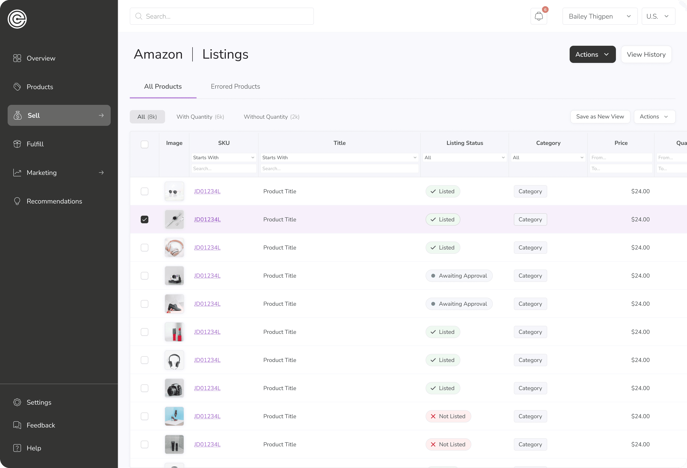
✅ Condensed similar views
✅ Made tab hierarchy more clear
✅ Enhanced important status chips
✅ Added product images for quick scanning
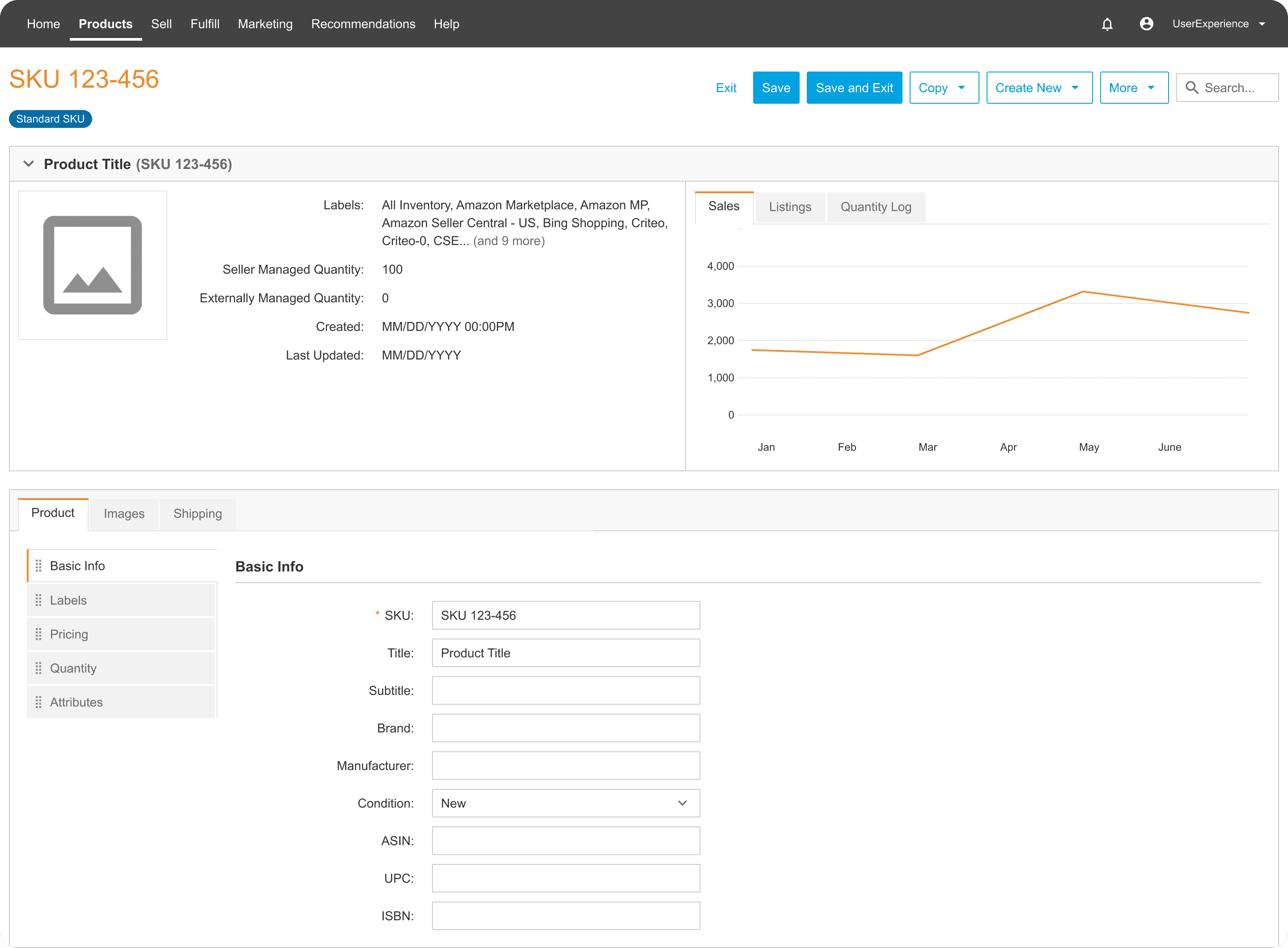
Product Details
Before
After
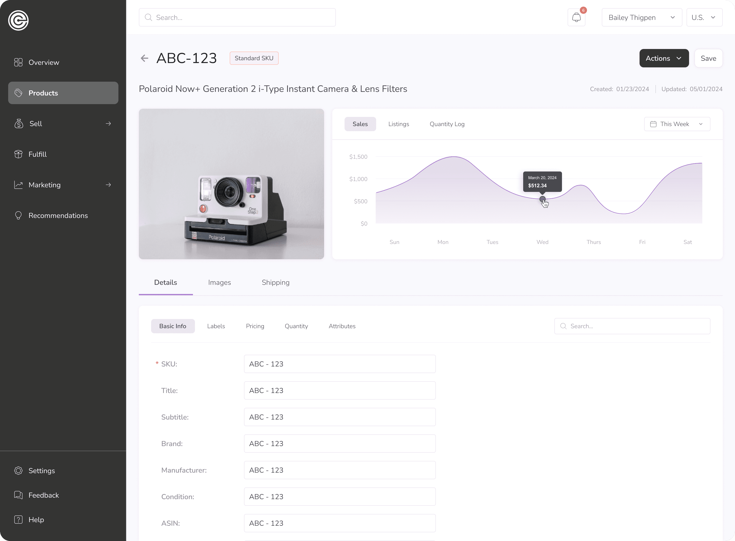
✅ Hid uncommon actions to reduce cognitive overload
✅ Removed redundant information causing clutter
✅ Improved information hierarchy
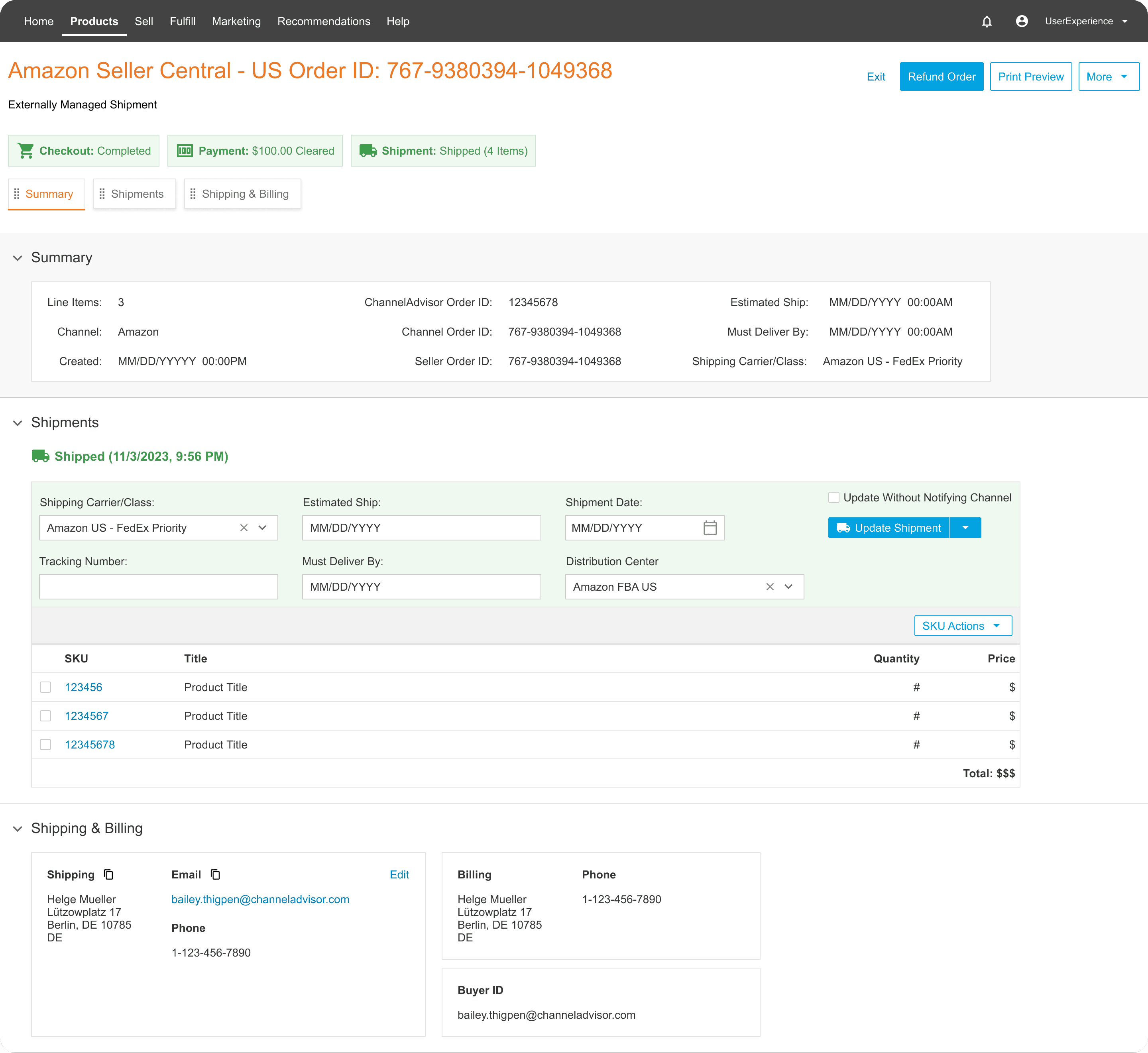
Order Details
Before
After
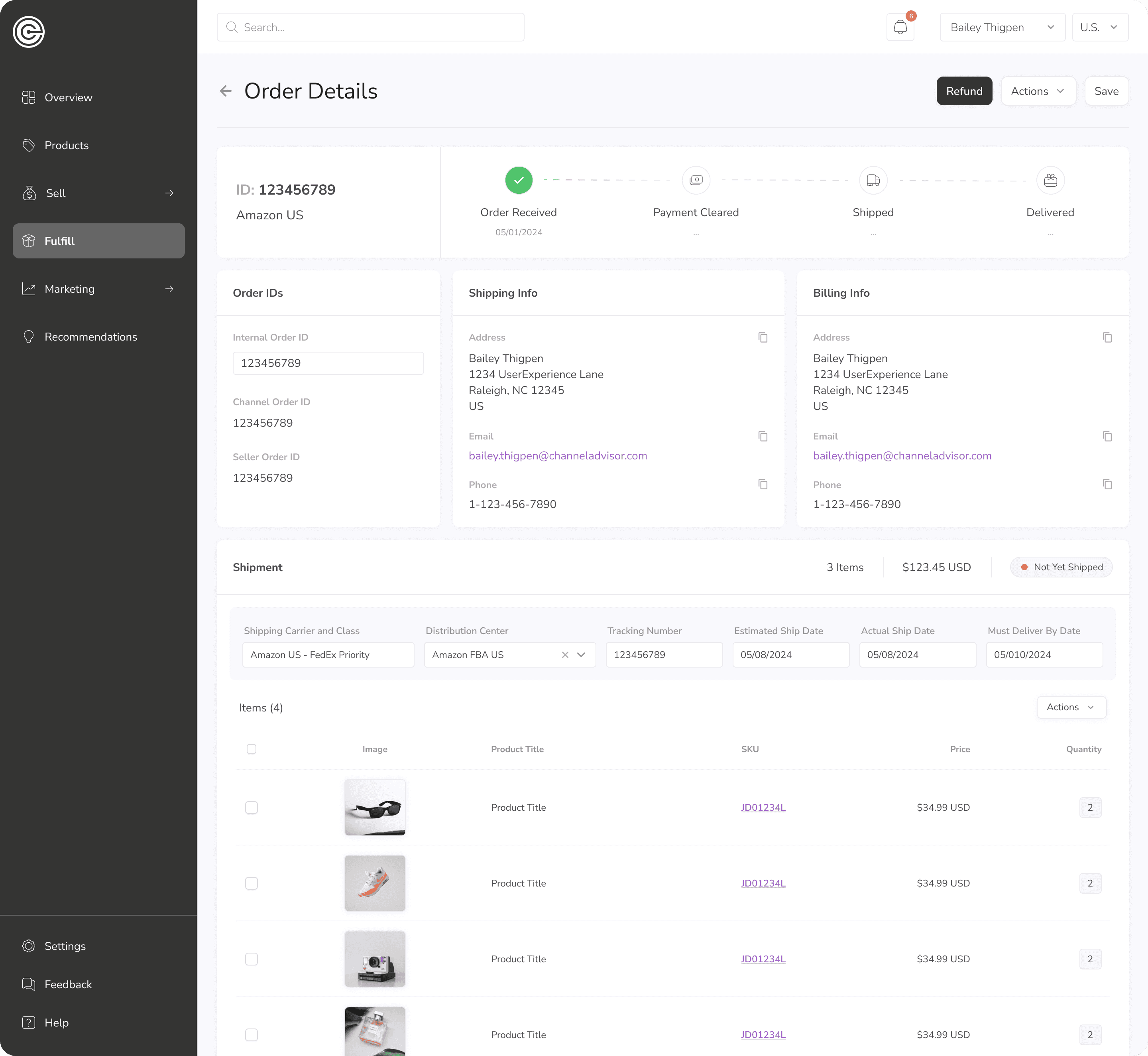
✅ Redesigned page structure for quick visibility of most important items
✅ Restructured order status for clarity
✅ Enhanced shipment info with product images
✅ Reduced excess color causing overload