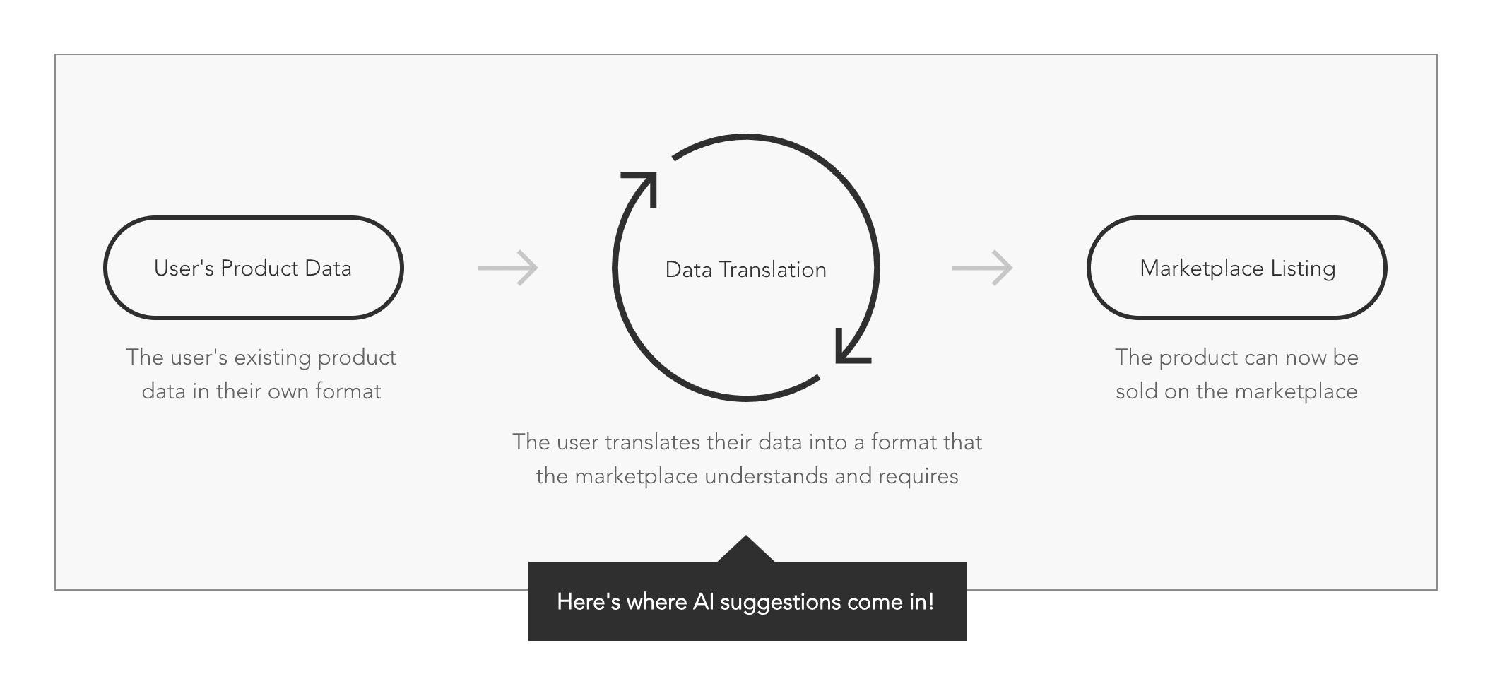
What is data mapping?
Data mapping enables users to convert their product data into formats compatible with various marketplaces, eliminating the need for data editing or maintaining separate data sources for each marketplace, despite their differing requirements.
The existing user experience
Here's how users view and interact with suggested data mappings in this product today:
Data Mapping Page
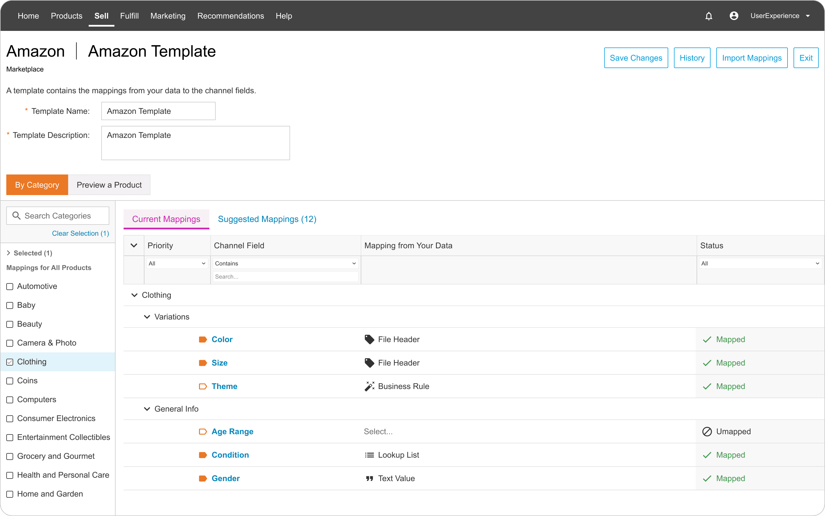
Users go to this page to see all of the required fields across all categories for this marketplace.
Data Field Open
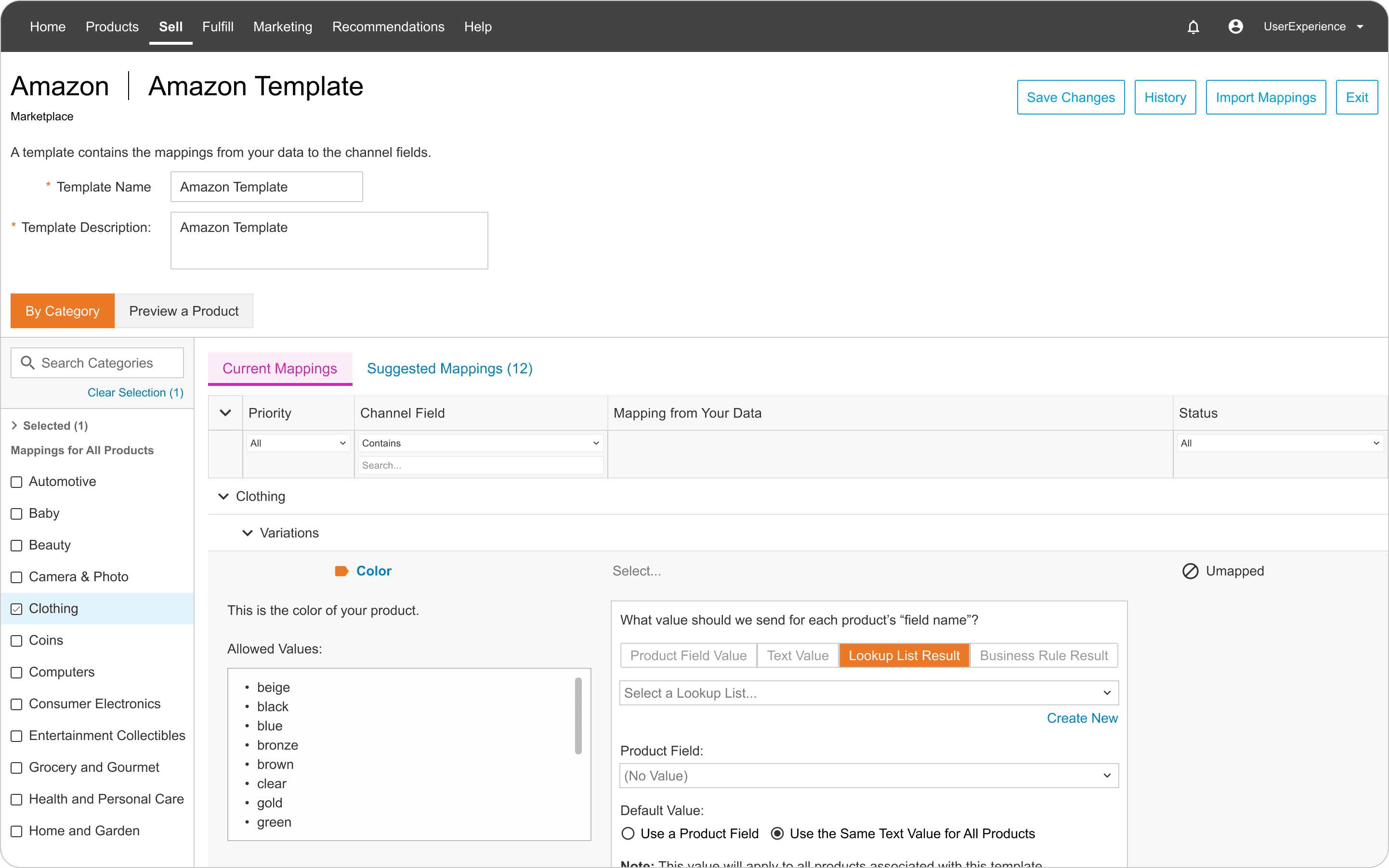
Users click into a field (or row) to see the allowed values for that field, data mapping options, and to complete their data mapping.
Suggestions Tab
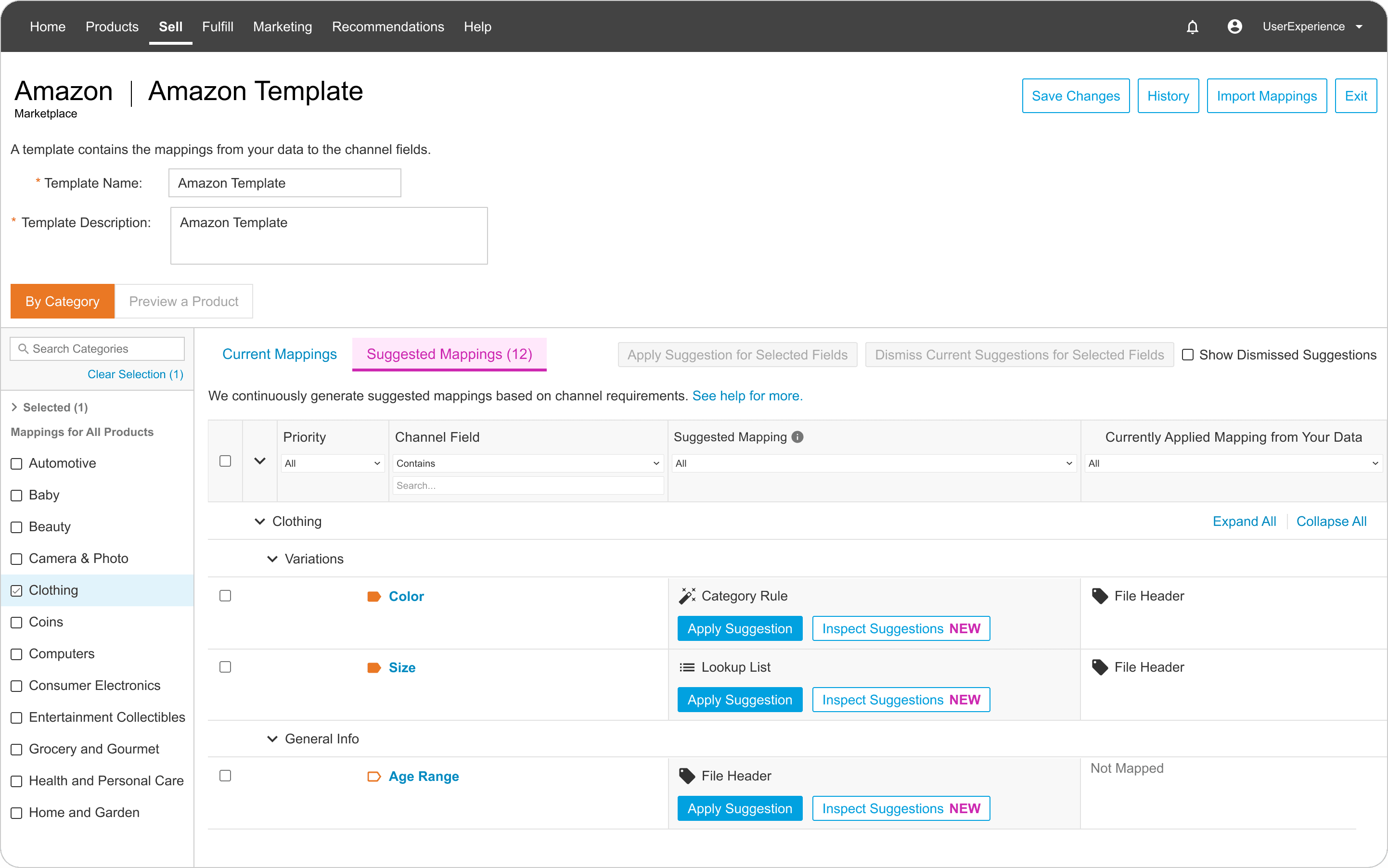
The suggestions are presented on a separate tab, in a new format. Many actions are available, such as Apply, Dismiss, and Inspect.
Suggestion
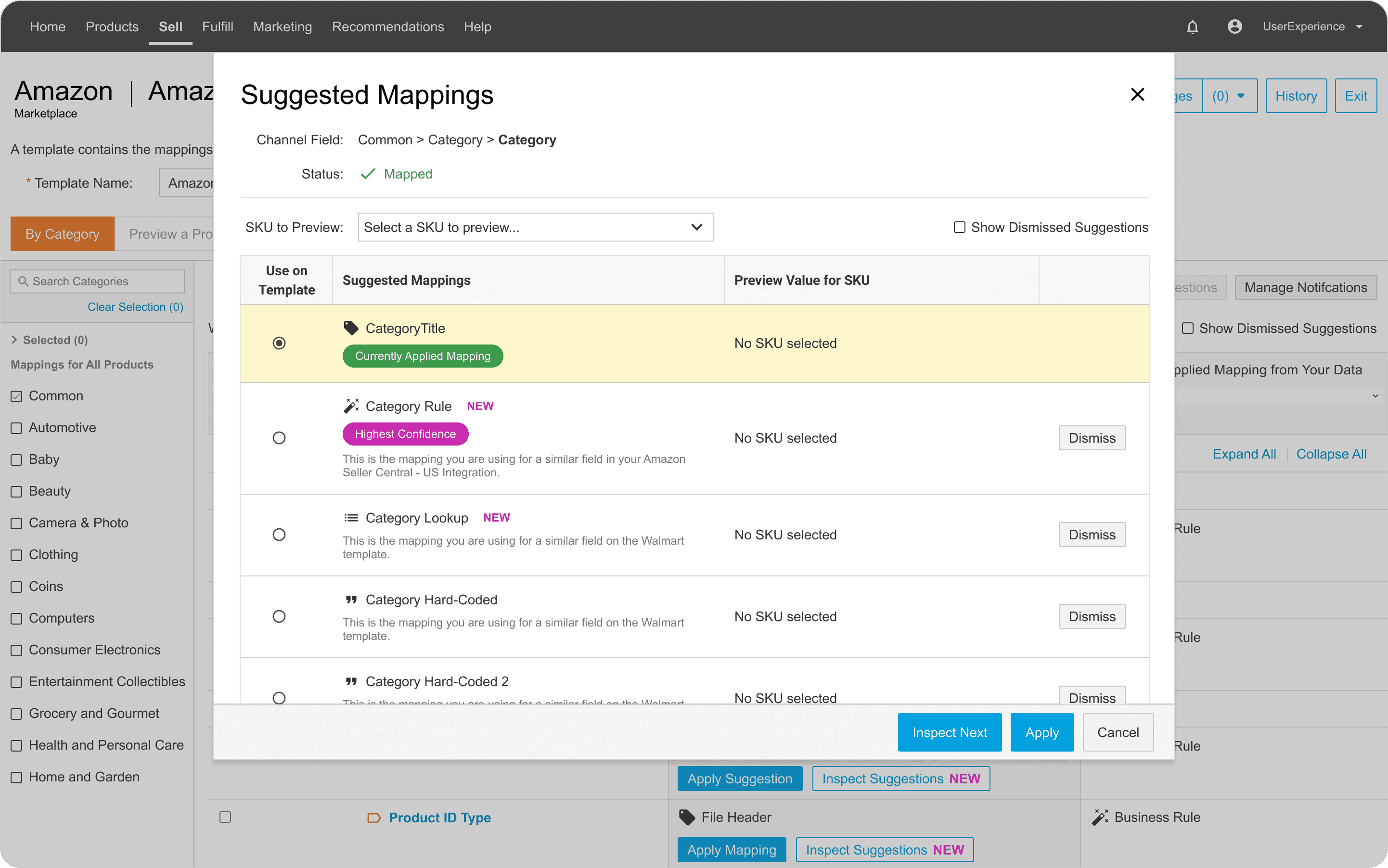
Clicking "Inspect Suggestions" opens a modal the suggestion's details, and a list of other suggestions if the first one doesn't work.
Identifying users for testing
I utilized our data analytics tool (Pendo) to identify active users of the data mapping page within the product. By analyzing the data, I selected users with low, medium, and high levels of engagement to ensure a comprehensive range of perspectives.
Defining research objectives
I created a research plan, starting by identifying the primary objectives based on what I think would help inform the future design direction.
01
Learn how users are using the feature today
02
Uncover general usability issues with the current experience
03
Understand the pros and cons of the feature from the user's perspective
Coming up with the testing questions
Here is a sample of the questions I planned to ask during testing:
What is your first impression of the information displayed on the page?
Walk me through your process of evaluating a suggested mapping.
What information do you need to decide whether or not to apply the suggestion?
What questions come up when looking at the list of suggestions?
After you have decided you want to use a suggestion, what would you do next?
After you have decided that you DON’T want to apply the suggestion, what would you do next?
Why would you apply one of our suggestions over the mapping you already had?
DO you find anything confusing or frustrating about the suggestions?
What do you like most about the suggestions?
How are these suggestions impacting your workflow?
If you could change one thing about this experience, what would it be?
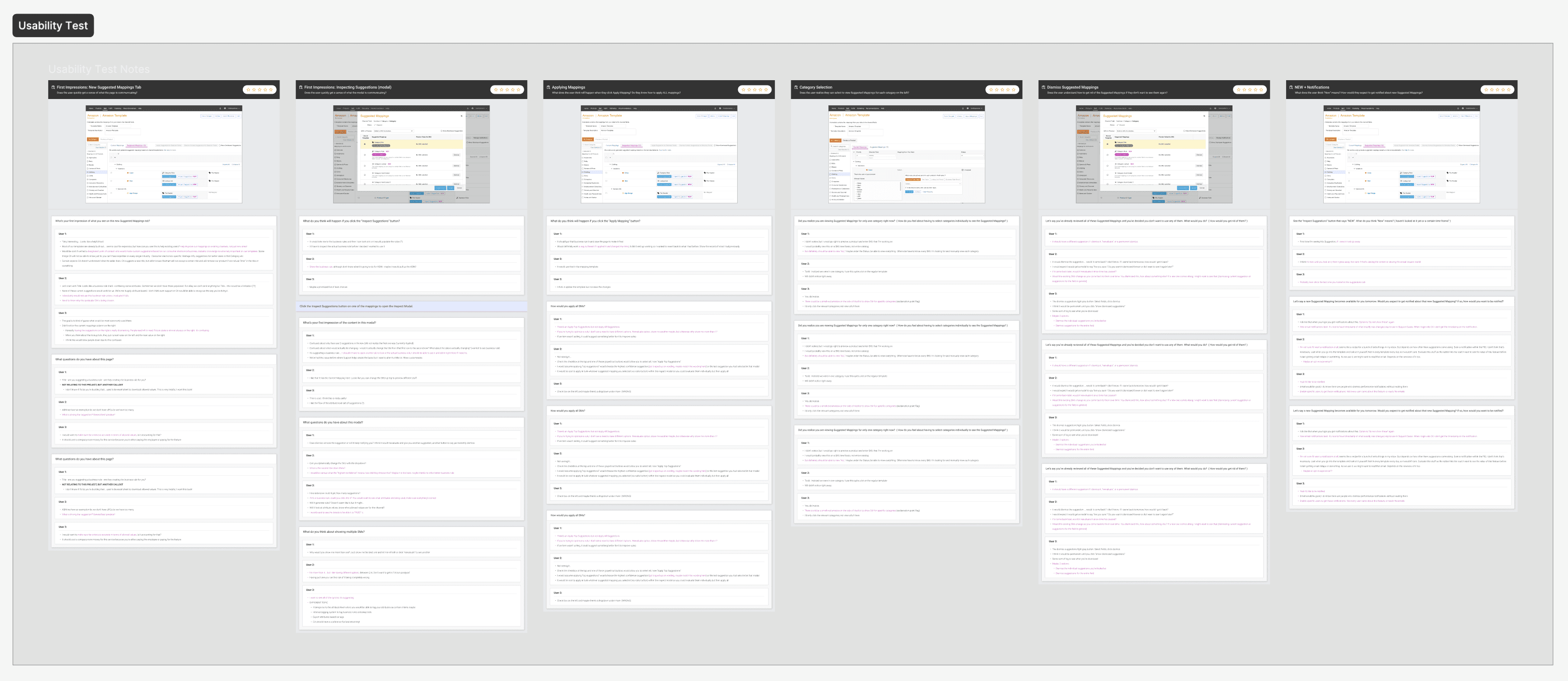
Conducting usability testing
Here is a high-level overview of the framework I used for note-taking and documentation. It includes screenshots of the screens presented to users, a list of questions asked for each screen, and the corresponding responses from each user.
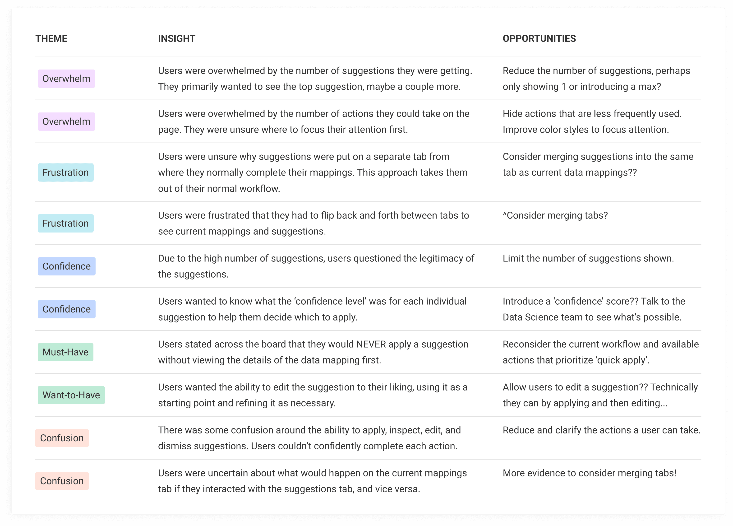
Key takeaways from testing
There were SO many learnings that it took awhile to analyze the data to identify common themes! Here were the primary insights:
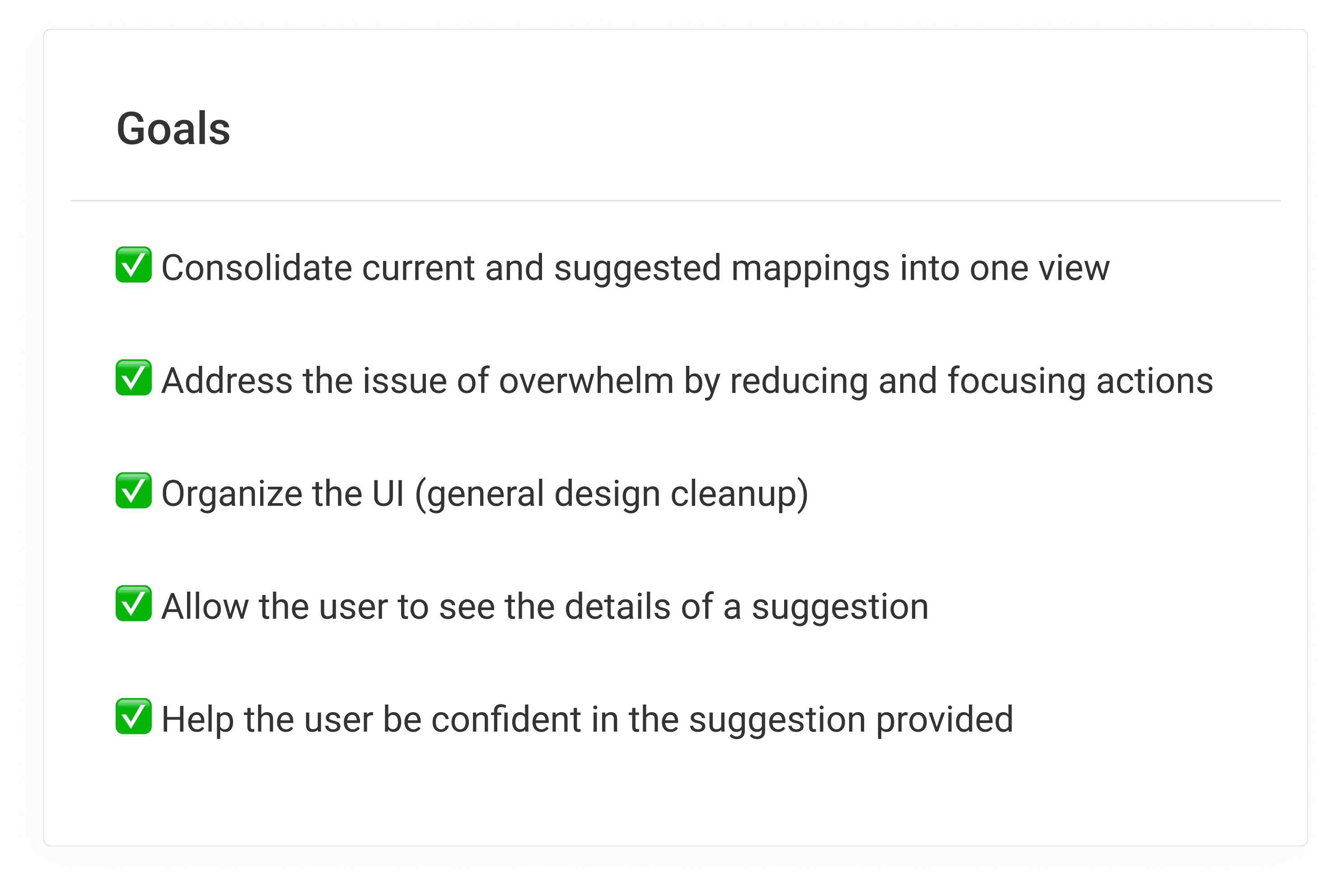
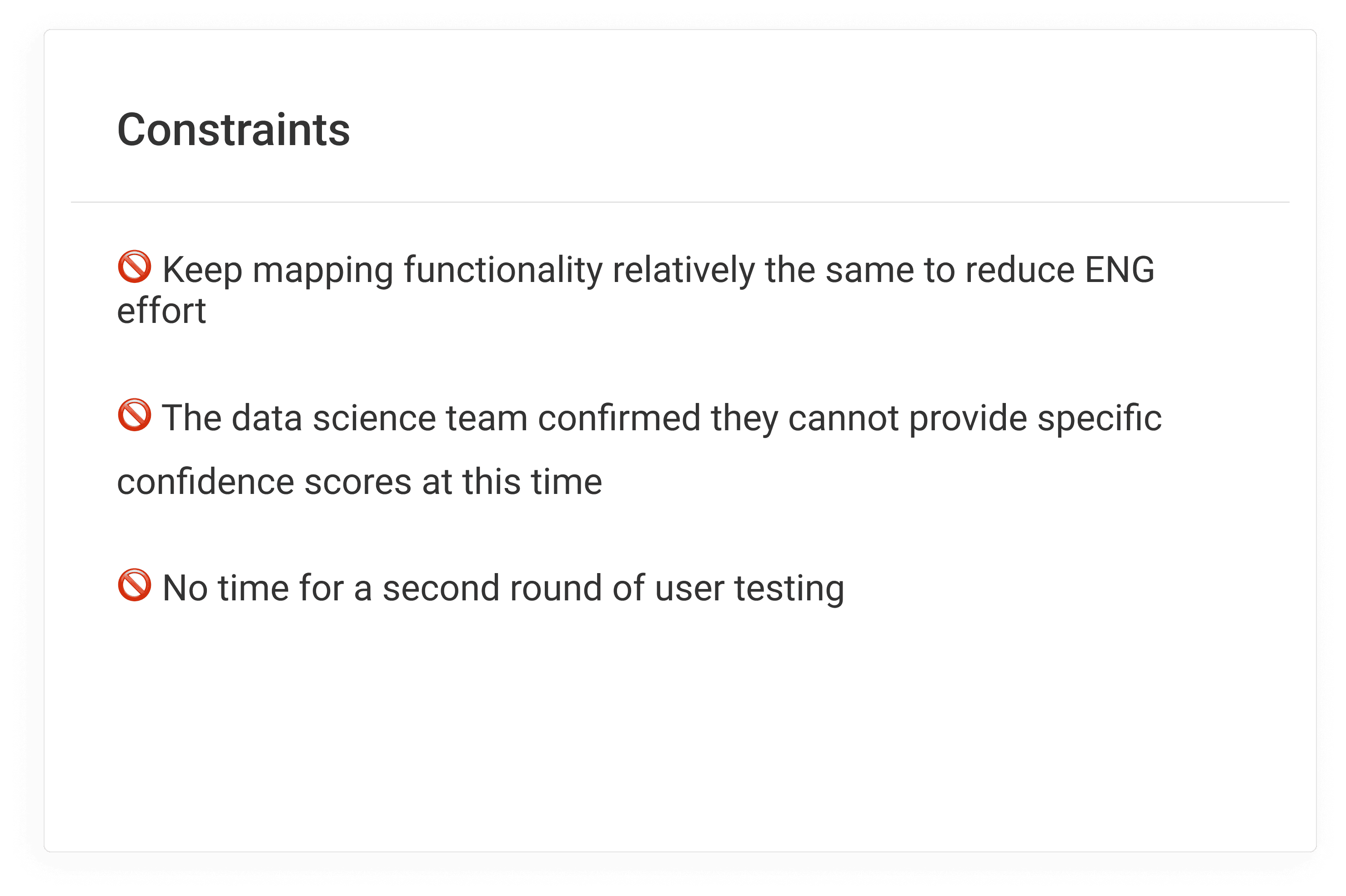
Goals and constraints for the design
Based on the insights gathered from our users, here are the goals and constraints outlined for the current project.
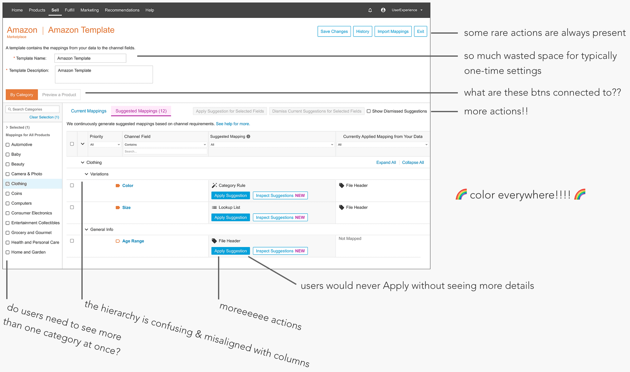
A while we're at it, a design audit!
I marked up the current UI with notes for areas of improvement and cleanup.
The first iteration
In my first pass at the design, I merged current and suggested mappings into one view and did some general UI cleanup. The user clicks a button on the field to open a modal to review the suggestions for that field.
Feedback from internal stakeholders
The overall feedback indicated that the suggestions felt disconnected from the existing data mapping experience. Additionally, the modal approach was not well-received, as it interrupts the user's workflow during the review and editing of mappings.
Back to the drawing board
I continued iterating to figure out the best approach to create a seamless view and flow of reviewing suggested data mappings.
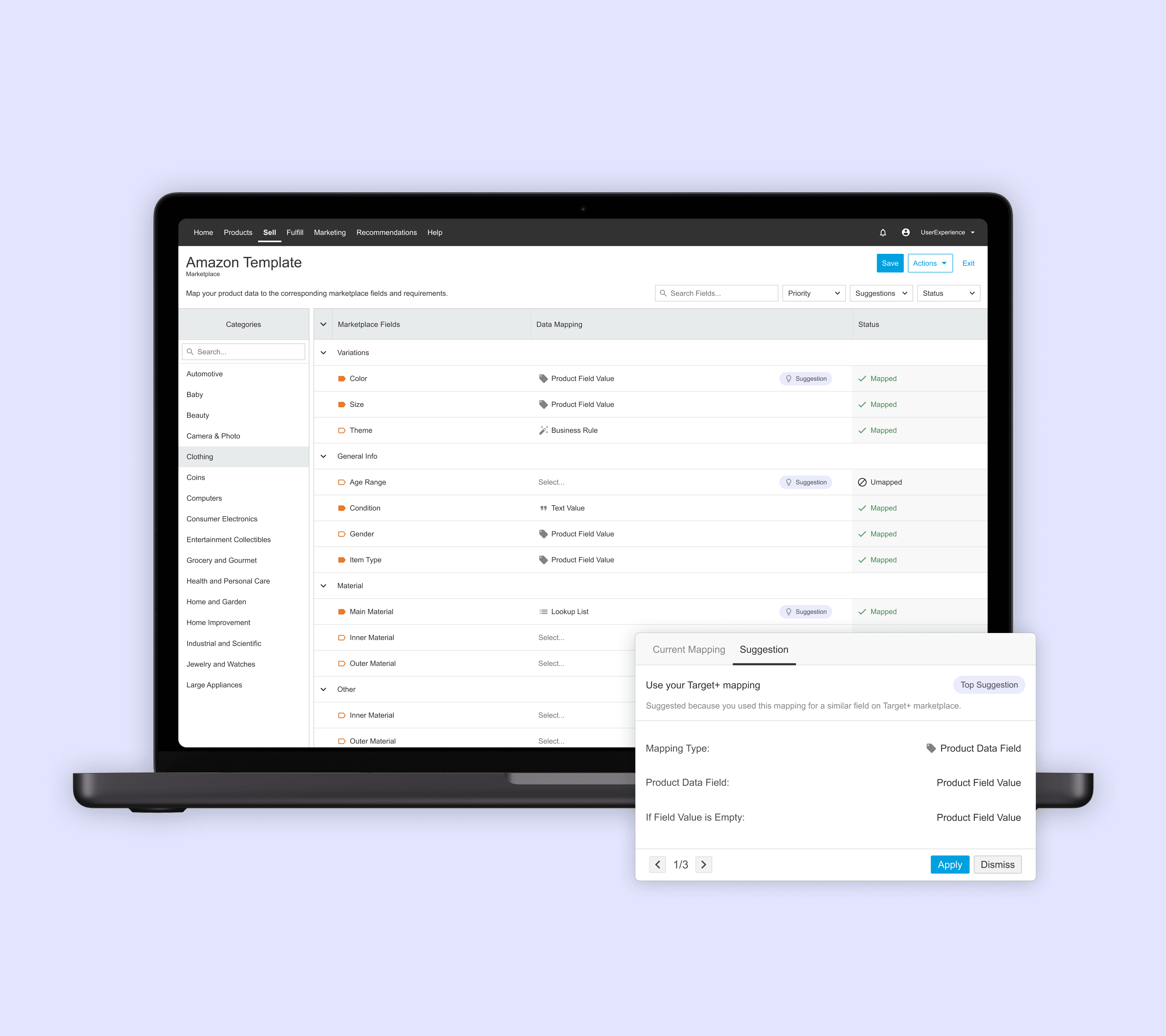
Final designs
After a few more rounds of internal feedback, we landed on a final design that best met the needs of our users!
Main Data Mapping Page
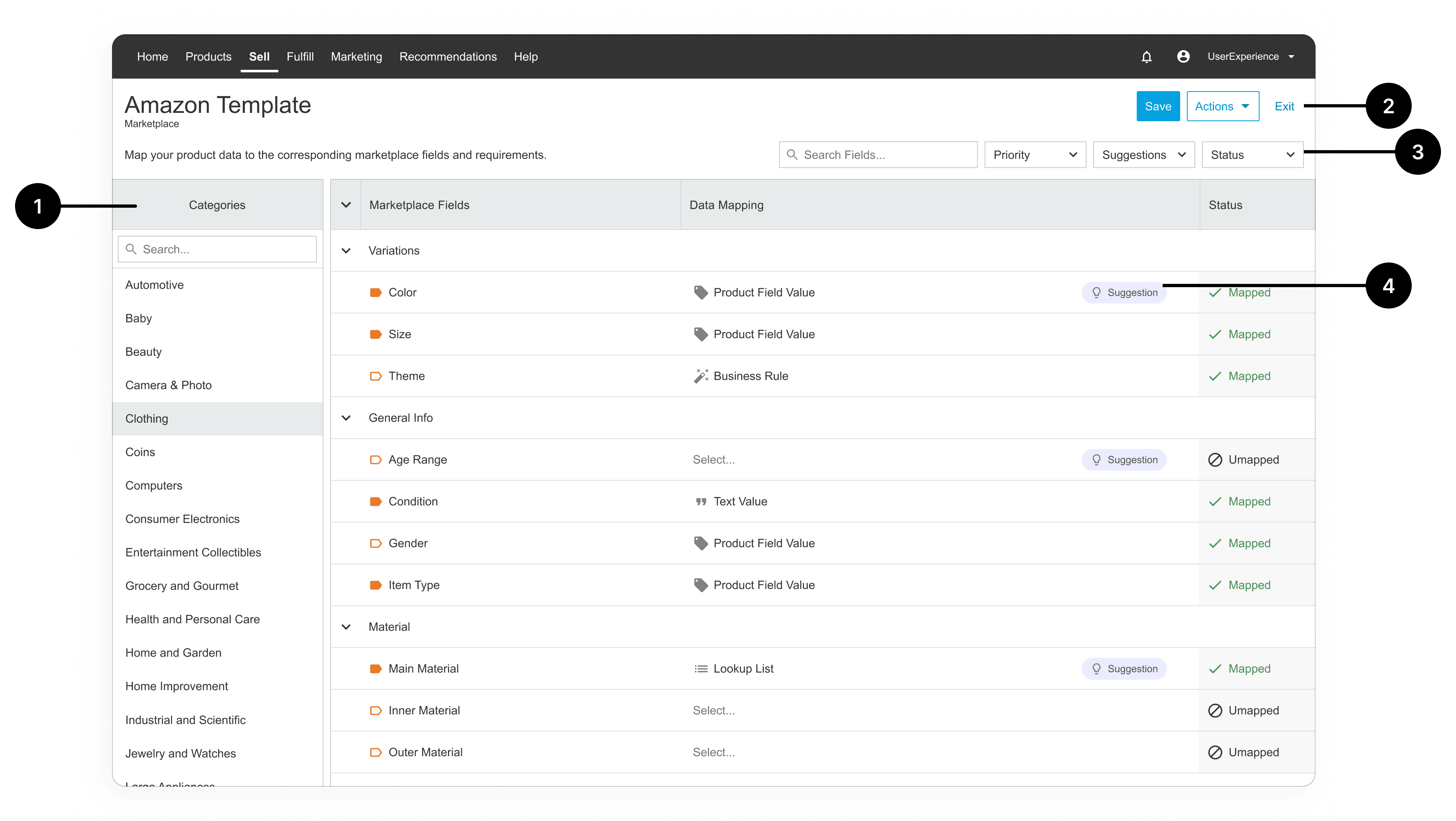
Reduced the number of page-level buttons, hiding infrequent actions behind a drop-down button
Moved important filters above the table to clean up the table view and remove column/value misalignment
Reconfigured the category selector so the user can focus on one category at a time, which fixes the awkward row hierarchy in the table
Introduced a subtle call out at the field level for suggestions
(not labeled) Overall altered and reduced the colors on the page to help focus the user's attention on the primary actions, callouts, and statuses
Data Field Open
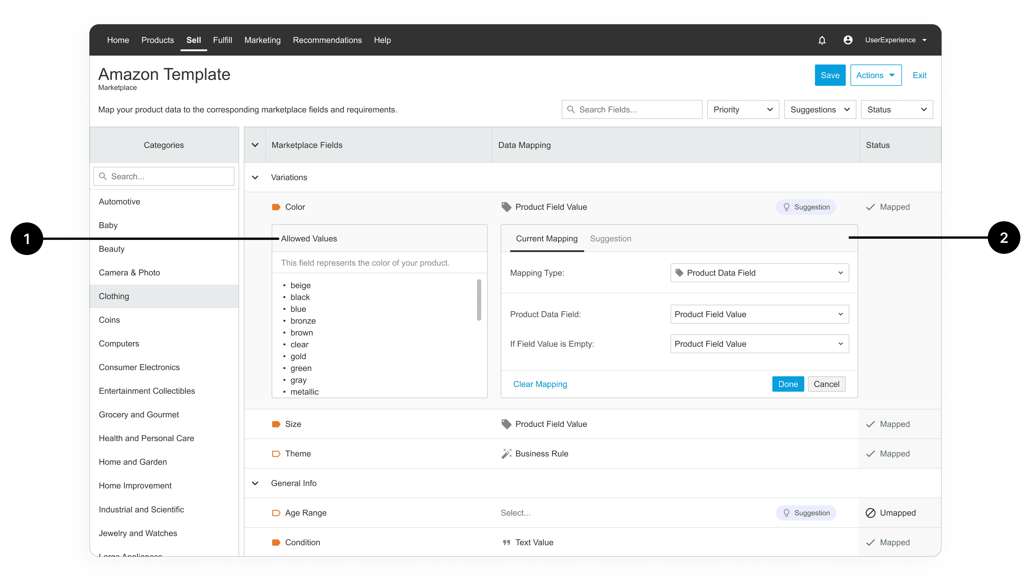
Cleaned up the section that provides information on the marketplace's allowed values
Redesigned the data mapping selections
Repositioned and redesigned the primary, secondary, and tertiary CTA buttons
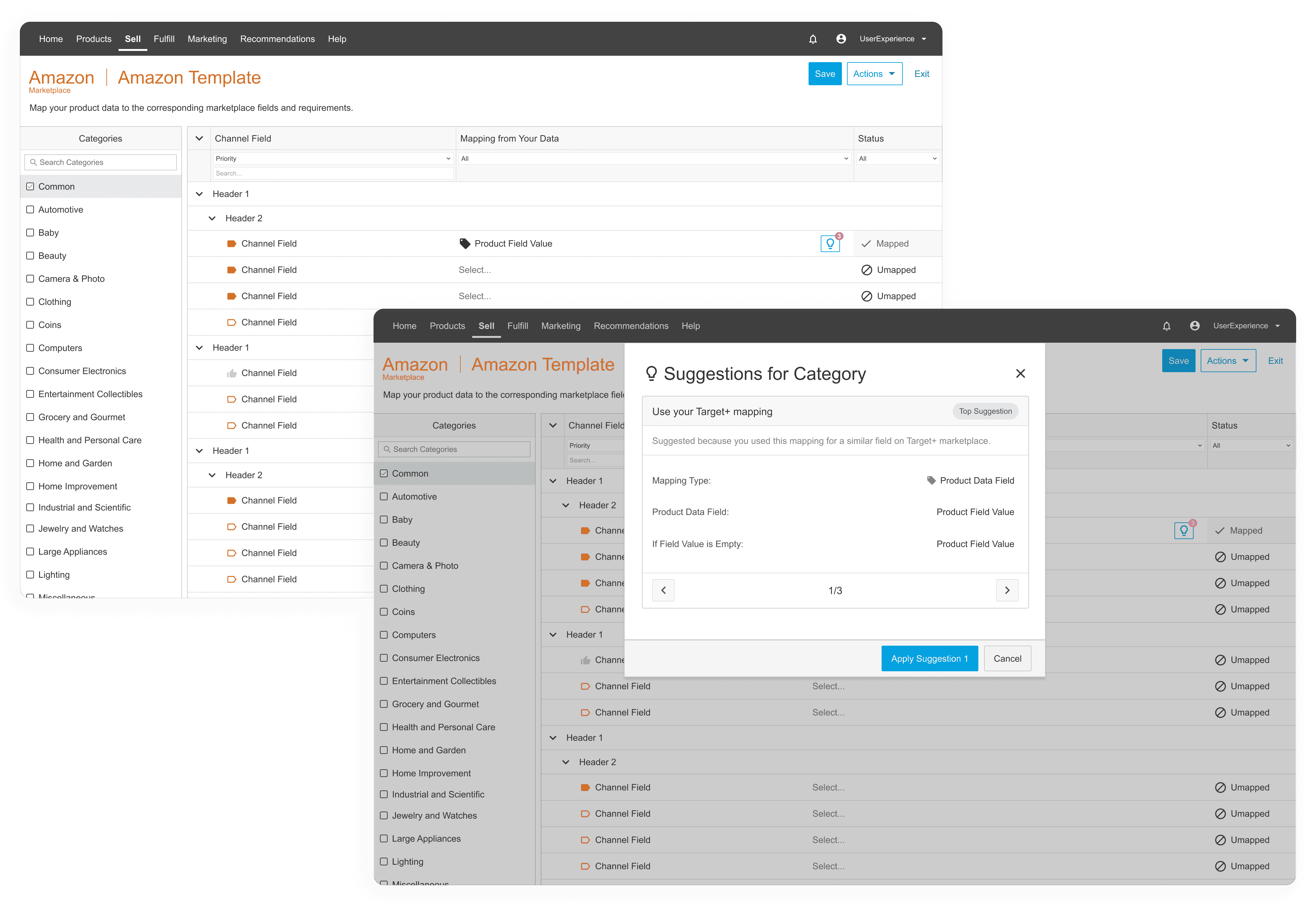
Data Mapping Suggestions
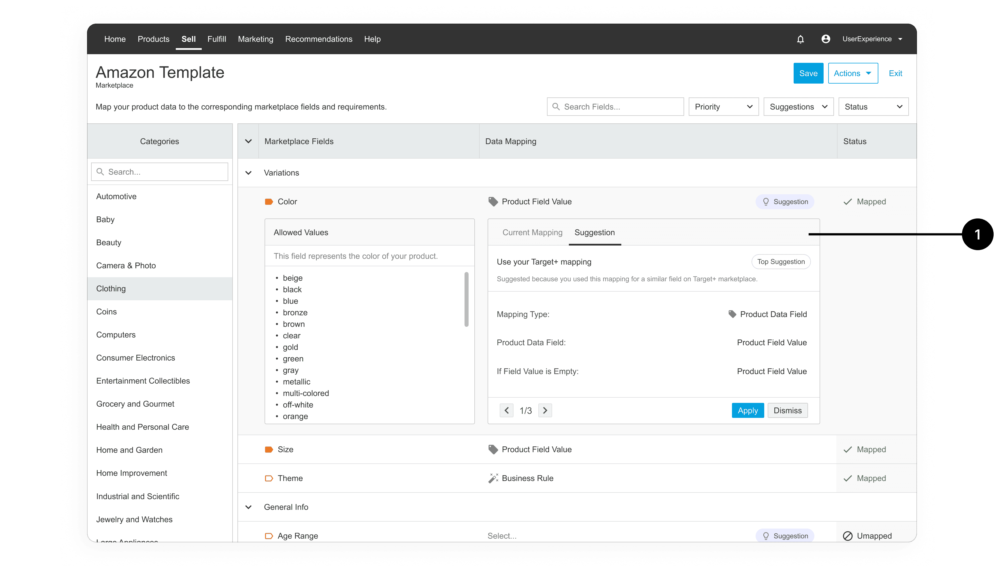
New UI for the suggested mapping, including:
User can easily toggle between their current mapping and the suggestion for that particular field
User can fully evaluate all details of the mapping before making the decision to apply
User can still see the marketplace's allowed values next to the suggestion to validate it
The top suggestion is called out with a label (will hopefully soon replace that with a true confidence score)
User can flip through a maximum of 3 suggestions
Applying the suggestion immediately updates the current mapping, and the user will have an option to 'revert' if needed
User can dismiss any or all suggestions to remove them from view
Reflections
The research insights learned here were invaluable for this project and beyond. It was so fun to collaborate with the data science team and learn more about machine learning algorithms. I'm excited for users to start using this new design so that I can get more feedback and refine the design further. This was a challenging project to be fully design-led, but very rewarding to see the before and after screens side by side!